- Color scheme
- Section width
- Heading
- Heading size
- Subheading
- Text size
- Collection
- Product display settings
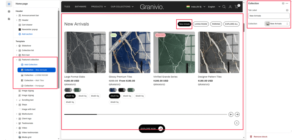
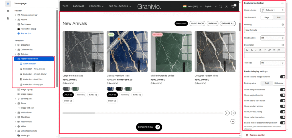
Featured Collection section to promote key products from a specific Shopify collection. You can display collection images, customize heading and text, and control product card appearance.
This section supports both grid and slider layouts and includes settings for spacing, buttons, and responsive behavior.
Color scheme #
Applies your chosen theme color scheme to section backgrounds and text.
Section width #
Choose how wide the section spans on the page:
- Page – constrained to main content width.
- Full – spans the full browser width.
Heading #
Title displayed at the top of the section.
Heading size #
Select heading size from theme-defined options such as h1, h2, h3, h4, h5, h6.
Subheading #
Optional text displayed under the main heading for descriptive or promotional content.
Text size #
Select text size from theme-defined options such as h1, h2, h3, h4, h5, h6.
Collection #
Choose which collection to display products from. Products automatically load from the selected collection.
#
Product display settings #
Show the second image on hover #
Enables a secondary product image to appear when hovering over the product card.
Desktop view mode #
Choose how products appear on desktop:
- Grid—static layout.
- Slider—scrollable carousel format.
Show the add to cart button #
Adds an “Add to Cart” button beneath product cards for quick purchasing.
Show product vendor #
Displays the product’s vendor/brand name below the title.
Show product rating #
Displays product star ratings (requires Shopify Product Reviews or a compatible app).
Show variant swatches #
Shows available variants as swatches or buttons.
Enable mobile slider (for grid view) #
When enabled, it converts the product grid into a swipeable slider on mobile devices for better usability.
Products per row (desktop) #
Set how many products to display per row.
Products per row (mobile) #
Set how many products to display per row on smaller screens.
Products limit #
Define the total number of products to display from the collection.
Show the “View all” button #
Toggle to show or hide a button linking to the full collection page.
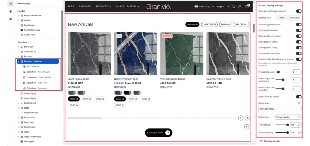
Top padding #
Adds spacing above the section to adjust layout spacing.
Bottom padding #
Adds spacing below the section for layout balance.
Blocks #
Tab label #
Select multiple blocks to show tabs and write the tab label; otherwise, show the collection name.
Collection: Select a collection to show the selected collection’s products.