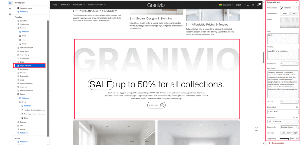
The Image with Text section is designed to pair strong visual storytelling with concise, impactful messaging. It allows you to display an image alongside descriptive text, headings, and call-to-action buttons — perfect for highlighting product features, brand values, or promotional content.
Section Settings #
Color scheme #
Choose a predefined color palette to match the section with your store’s theme style.
Section Width #
- Page: Constrains the content to the theme’s maximum site width.
- Full: Stretches the section to the edges of the browser window.
Image #
Upload a background image or decorative graphic that sits behind the primary text.
Label #
Enter short, high-visibility text (e.g., “SALE”) to appear in the stylized outline badge.
Heading #
Add the main promotional title. This typically appears next to the label.
Heading size #
Adjust the scale of the heading from H1 to H6 to establish visual hierarchy.
Description #
Enter a detailed paragraph to provide more context about the promotion or offer.
Text size #
Control the font size of the description paragraph for better readability.
Button label #
Input the text for the action button (e.g., “CHECK NOW”).
Button link #
Select the destination page, product, or collection the button should lead to.
Button style #
Choose between available button styles. The styles depend on your theme’s design system.
- Button icon
- Primary button
- Secondary button
- Full button
- Link button
- Button with icon
Text Align #
Set the alignment of the text and button to left, center, or right.
Top/Bottom Padding #
Adjust the vertical spacing (in pixels) to give the section room to breathe.