

Footer
On this page
The Footer Section appears at the bottom of your Shopify theme and is divided into multiple customizable blocks. It supports a background image, color scheme, newsletter subscription, multiple menus, contact information, and an image logo.
Color scheme
Choose the color scheme that matches your site design. This affects text and button colors over the video.
Section width
Choose how wide the section appears on the page:
- Full – expands the video to full browser width.
- Page – keeps the video within page content width.
Source
Choose the background source: image, video, none.
Typically used for setting a background image.
Fallback image
Upload an image used as a background when “image” is selected as the source.
Enable border top
Adds a thin line across the top of the footer for separation from the main page.
Enable country/region selector
Displays a dropdown menu for choosing country or region.
Show social media icons
Toggles visibility of your social media icons (Facebook, Instagram, etc.).
Show payment icons
Shows payment method icons (Visa, PayPal, etc.) supported by your store.
Enable follow on shop
Adds a “Follow on Shop” option.
Top padding
Controls the spacing above the footer content.
Bottom padding
Controls the spacing below the footer content.
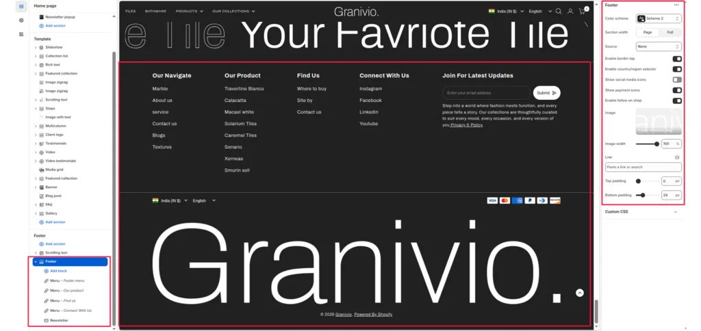
Blocks Section
1. Newsletter Block
Used for adding a newsletter signup form.
Settings
- Newsletter title: Text heading above the email input field. Example: “Subscribe to our newsletter.”
- Newsletter text: Optional description below the title.
- Social link title: Text heading shown before social media icons.
Features
- Includes an email input field.
- Uses Shopify’s built-in newsletter form.
- Displays social media icons if enabled in section settings.
2. Menu Block
Displays a navigation menu with links.
Settings
- Menu: Select an existing Shopify navigation menu.
- Show menu title: Enable or disable the menu title.
- Menu title: Custom title text for the menu. Example: “Company,” “Help,” or “Pages.”
Features
- Displays a vertical list of links.
- Commonly used for policy, about, or informational links.
3. Text Block (Contact Information)
Used to display plain or rich text such as contact details, address, or business hours.
Settings
- Heading: Title of the block (e.g., “Contact Us”).
- Heading size: Choose the heading size (H1 to H6).
- Text: Rich text area for content like address, email, or phone number.
- Text size: Choose text size (
h5orh6).
Features
- Supports clickable links (like mailto or tel).
- Used for showing static business info.
4. Image Block (Logo)
Used to display a logo or brand image in the footer.
Settings
- Image: Upload a logo image.
- Image width: Adjust how wide the image appears (10% – 100%).
- Link: Optional link that makes the image clickable (e.g., to homepage).
Features
- Typically used for brand or certification logos.
- Image scales responsively.
Was this article helpful?
Thanks for the feedback.
Still need help?
Can't find what you're looking for? Send us a message and we'll help you out.