

Steps
On this page
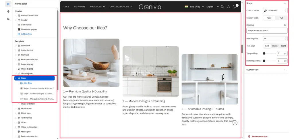
The Steps section is a structured layout designed to explain processes, company values, or “Why Choose Us” features using images and numbered text.
Section Settings
Color scheme
Choose the color scheme that matches your site design. This affects text and button colors over the section.
Section width
Choose how wide the section appears on the page:
- Page—keeps the video within the page content width.
- Full—expands the video to full browser width.
Heading
Add a main heading for the section.
Heading size
Select a heading size from theme-defined options such as h1, h2, h3, h4, h5, and h6.
Text Align
Controls the alignment of the section heading and text.
- Left
- Center
- Right
Top Padding / Bottom Padding
Adjusts vertical spacing above and below the section.
Block Settings
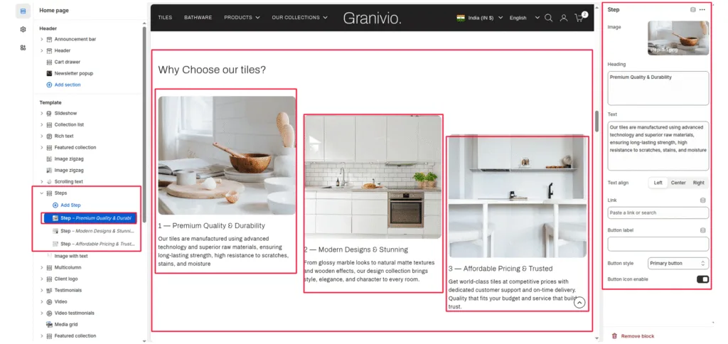
Each “Step” block represents a single column within the section:
Image
Upload a visual representation for that specific step.
Heading
The name of the step.
Description
The main paragraph or supporting text under the heading.
Text Align
Controls the alignment of the section heading and text.
- Left
- Center
- Right
Button label
Enter the call-to-action text for the button.
Button link
Choose the link destination for the button (e.g., All Products collection or a custom URL).
Button Style
Determines the design of the button.
- Primary button
- Secondary button
- Full button
- Link button
- Button with icon
- Button icon
Button icon enable
Enable or disable an arrow icon inside the button.
Was this article helpful?
Thanks for the feedback.
Still need help?
Can't find what you're looking for? Send us a message and we'll help you out.