

Image card
On this page
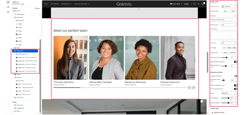
The Image Card section allows merchants to showcase multiple promotional image blocks in either a grid layout or a slideshow layout. Each card can display an image, title, description, and call-to-action button. This section is ideal for highlighting featured categories, collections, or brand stories.
Color Scheme
Controls the overall background and text color of the section using theme color presets.
Section Width
Choose whether the content is contained within Page width or spans Full width.
Heading
Main heading for the section.
Heading Size
Select the visual size of the heading (H1-H6).
Description
Optional text that appears under the heading.
Text Size
Controls the size of the description text (H1-H6).
Text Align
Align the heading and description to Left, Center, or Right.
Layout Settings
Desktop View
Choose between two display modes for desktop:
- Grid – displays cards in multiple columns
- Slideshow – displays image cards in a swipeable slider
Desktop Columns
Select how many cards to show per row in grid mode (example: 2, 3, 4).
Enable Mobile Slideshow
Enable or disable slideshow mode on mobile even when desktop uses grid layout.
Mobile Slides Per View
Set how many slides appear at once in mobile slideshow mode.
Slideshow Settings
Enable Desktop Slideshow
Activates slideshow mode on desktop.
Autoplay Slideshow
Automatically cycles through slides.
Slideshow Speed
Slide transition interval (in milliseconds).
Show Navigation Arrows
Display left and right arrows for manual slide navigation.
Source
Choose External URL to embed YouTube or Vimeo videos or Image.
Top Padding
Adjusts the top spacing of the section.
Bottom Padding
Adjusts the bottom spacing of the section.
Block Settings
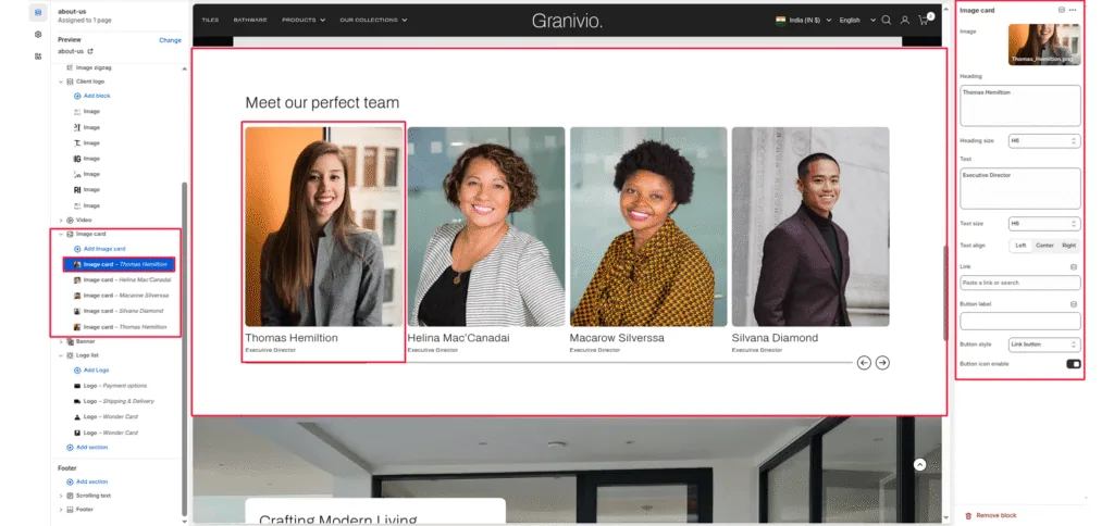
Each block represents one card inside the section.
Image
Upload or select the main image for the card.
Heading
Title shown below the image.
Heading Size
Select heading size (H1-H6).
Text
A short description supporting the heading.
Text Size
Controls the size of the card’s description text.
Text Align
Align card text to Left, Center, or Right.
Link
Attach a link to collections, pages, or products.
Button Label
Set the CTA button text (example: “SHOP NOW”).
Button Style
Select the style of the button (e.g., Link button, Solid button).
Button Icon Enable
Enable or disable an arrow icon inside the button.
Was this article helpful?
Thanks for the feedback.
Still need help?
Can't find what you're looking for? Send us a message and we'll help you out.