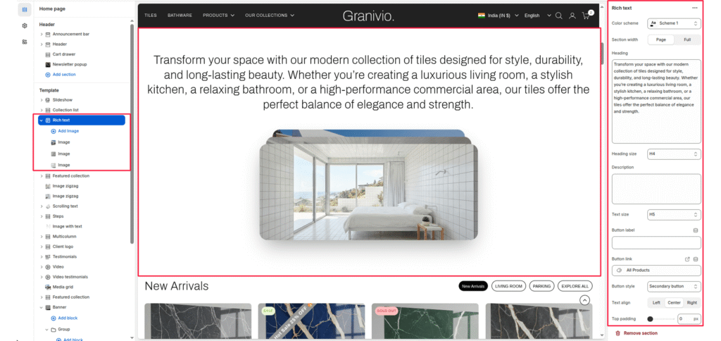
The Rich Text section is a versatile component used to introduce collections, tell your brand story, or highlight key value propositions. It features a centralized heading and a unique overlapping image stack (card style) for visual flair.
Color Scheme #
Select a predefined color palette (background/text colors) from your theme settings.
Section Width #
- Page: Constrains the content to the theme’s maximum site width.
- Full: Stretches the section to the edges of the browser window.
Heading #
Enter the main text for the section. This field supports multi-line text to create a bold statement.
Heading Size #
Choose from H1 (largest) to H6 (smallest) to manage visual hierarchy.
Description #
Add a secondary paragraph of text below the heading.
Text Size #
Controls the font size of the description text.
Button Label #
Enter text (e.g., “Shop Now”) to display a call-to-action button.
Button Link #
Paste a URL or select a page/product from the Shopify store.
Button Style #
Choose between available button styles. The styles depend on your theme’s design system.
- Button icon
- Primary button
- Secondary button
- Full button
- Link button
- Button with icon
Text Align #
Set the alignment of the text and button to left, center, or right.
Top/Bottom Padding #
Adjust the vertical spacing (in pixels) to give the section room to breathe.