Table of Contents
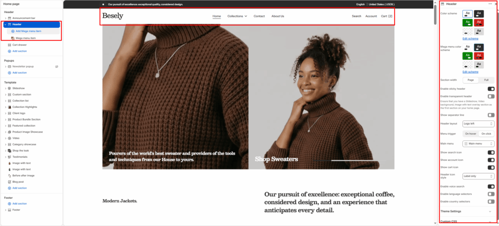
Appears at the top of every page and provides key navigation and store utilities, including your logo, menu, search, account, and cart icons.
Section settings #
- Color scheme: Choose which color scheme (defined in Theme settings → Colors) this element uses.
- Mega menu color scheme: Choose which color scheme (defined in Theme settings → Colors) this element uses.
- Section width: Choose from: “Page”, “Full”.
- Enable sticky header: Switch this on to activate sticky header.
- Enable transparent header: Ensure that you have a Slideshow, Video background, Image with text overlay section as the first section on your home page.
- Show separator line: Displays separator line when this is switched on.
- Header layout: Choose from: “Logo centered”, “Logo left”, “Logo top center (double-row)”, “Logo top left (double-row)”, “Drawer”.
- Menu trigger: Choose from: “On hover”, “On click”.
- Main menu: Choose the navigation menu to display (menus are managed under Online Store → Navigation in Shopify admin).
- Show search icon: Displays search icon when this is switched on.
- Show account icon: Displays account icon when this is switched on.
- Show cart icon: Displays cart icon when this is switched on.
- Header icon style: Choose from: “Icon only”, “Label only”, “Icon and label both”.
- Enable voice search: Switch this on to activate voice search.
- Enable language selectors: Switch this on to activate language selectors.
- Enable country selectors: Switch this on to activate country selectors.
Double-row header settings #
- Bottom row color scheme: Choose which color scheme (defined in Theme settings → Colors) this element uses.
- Hide bottom row on scroll: Hides bottom row on scroll when this is switched on.
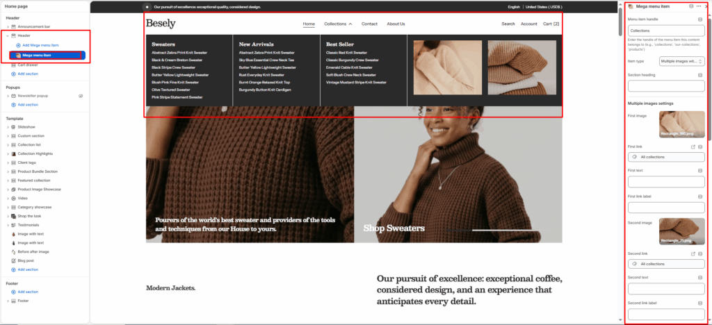
Mega menu item block #
- Menu item handle: Enter the handle of the menu item this content belongs to (e.g., ‘collections’, ‘our-collections’, ‘products’)
- Item type: Choose from: “Multiple images with links”, “Multiple page links”, “Featured products from collection”, “Multiple collections”, “Blog posts”, “Custom content”.
- Section heading: Enter the text you want to display.
Multiple images settings #
- First image: Upload or select an image to display.
- First link: Link this element to a page, product, collection, blog, or external URL.
- First text: Enter the text you want to display.
- First link label: Enter the text you want to display.
- Second image: Upload or select an image to display.
- Second link: Link this element to a page, product, collection, blog, or external URL.
- Second text: Enter the text you want to display.
- Second link label: Enter the text you want to display.
- Third image: Upload or select an image to display.
- Third link: Link this element to a page, product, collection, blog, or external URL.
- Third text: Enter the text you want to display.
- Third link label: Enter the text you want to display.
- Fourth image: Upload or select an image to display.
- Fourth link: Link this element to a page, product, collection, blog, or external URL.
- Fourth text: Enter the text you want to display.
- Fourth link label: Enter the text you want to display.
Multiple pages settings #
- First page: Select a page to link or pull content from.
- Second page: Select a page to link or pull content from.
- Third page: Select a page to link or pull content from.
- Fourth page: Select a page to link or pull content from.
Products settings #
- Select collection for products: Select the collection to feature.
- Number of products to show: Fine-tune this value with the slider.
Multiple collections settings #
- Collection first: Select the collection to feature.
- Collection second: Select the collection to feature.
- Collection third: Select the collection to feature.
- Collection fourth: Select the collection to feature.
Blog settings #
- Blog: Select the blog to pull posts from.
- Number of blog posts to show: Fine-tune this value with the slider.