Table of Contents
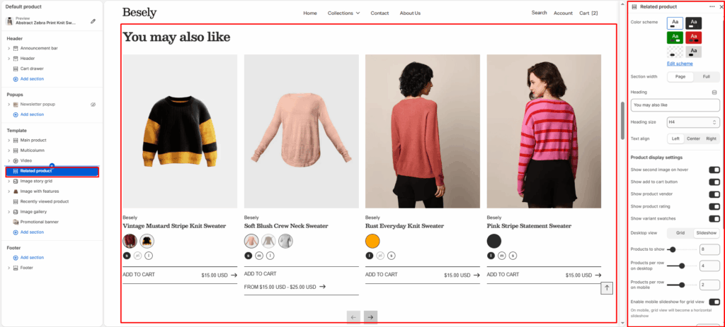
Displays a curated or automatic list of related products, typically shown on the product page.
Section settings #
- Color scheme: Choose which color scheme (defined in Theme settings → Colors) this element uses.
- Section width: Choose from: “Page”, “Full”.
- Heading: Enter the text you want to display.
- Heading size: Choose from: “H1”, “H2”, “H3”, “H4”, “H5”, “H6”.
- Text align: Choose from: “Left”, “Center”, “Right”.
Product display settings #
- Show second image on hover: Displays second image on hover when this is switched on.
- Show add to cart button: Displays add to cart button when this is switched on.
- Show product vendor: Displays product vendor when this is switched on.
- Show product rating: Displays product rating when this is switched on.
- Show variant swatches: Displays variant swatches when this is switched on.
- Desktop view: Choose from: “Grid”, “Slideshow”.
- Products to show: Fine-tune this value with the slider (from 2 to 50).
- Products per row on desktop: Fine-tune this value with the slider (from 2 to 6).
- Products per row on mobile: Fine-tune this value with the slider (from 1 to 3).
- Enable mobile slideshow for grid view: On mobile, grid view will become a horizontal slideshow
- Top padding: Fine-tune this value with the slider (from 0 to 100px).
- Bottom padding: Fine-tune this value with the slider (from 0 to 100px).
Slideshow settings #
- Autoplay slideshow: Turns the “Autoplay slideshow” option on or off.
- Speed (ms): Fine-tune this value with the slider (from 10 to 100).
- Show navigation: Displays navigation when this is switched on.
- Show scrollbar: Displays scrollbar when this is switched on.
- Pagination style: Choose from: “Dots”, “Progress bar”, “Numbers line”, “Circle progress”.