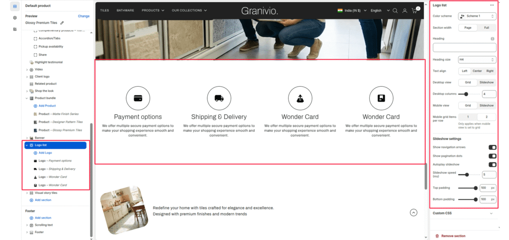
The Logo List section allows you to showcase brand features, partner logos, or certifications in a grid or slider layout.
Section Settings #
Color scheme #
Select your preferred color palette for the background and text.
Section Width #
- Full: Stretches the section to the edges of the browser window.
- Page: Constrains the content to the theme’s maximum site width.
Heading #
Add a main title for the section (for example: “Our Features”, “Our Partners”, or “Brand Certifications”).
Heading size #
Choose the heading tag (H1-H6) to control the visual prominence and SEO hierarchy.
Text align #
Align the heading and logo items to the Left, Center, or Right.
Desktop view #
Choose how the logos appear on desktop. Options: Grid or Slider.
Desktop columns #
Select the number of logos displayed per row when in Grid mode (commonly 3-6).
Mobile view #
Choose how the section appears on mobile devices—Grid or Slider.
Mobile grid items per row #
Set how many logos appear per row on mobile when using Grid view (usually 1 or 2).
Enable desktop slider #
Enable or disable the slider functionality on the desktop view.
Slider speed (ms) #
Define the transition speed between slides (in milliseconds).
Show navigation #
Display arrow controls for easy manual navigation.
Show pagination #
Display small dots below the slider to indicate the current slide.
Top padding / Bottom padding #
Adjust vertical spacing above and below the section for consistent layout spacing.
Blocks Setting #
Each Logo block represents one image item — a brand logo, product badge, or feature icon.
Logo image #
Displays a single logo or image within the grid or slider layout.
Logo background #
Choose a background color or style behind the logo. Useful for icons that need contrast or circular backgrounds.
Heading #
Add a heading for the icon.