The Product bundle section (often titled “Frequently Bought Together”) displays a collection of complementary products alongside a focused call-to-action card. This layout is perfect for interior design sets, tool kits, or matching tile collections.
Color scheme #
Choose a predefined color palette to match the section with your store’s theme style.
Section Width #
- Page: Constrains the content to the theme’s maximum site width.
- Full: Stretches the section to the edges of the browser window.
Heading #
Add the main promotional title.
Heading size #
Adjust the scale of the heading from H1 to H6 to establish visual hierarchy.
Text Align #
Set the alignment of the text and button to left, center, or right.
Description #
Enter a detailed paragraph to provide more context about the promotion or offer.
Text size #
Control the font size of the description paragraph for better readability.
Button label #
Input the text for the action button (e.g., “CHECK NOW”).
Button link #
Select the destination page, product, or collection the button should lead to.
Button style #
Choose between available button styles. The styles depend on your theme’s design system.
- Button icon
- Primary button
- Secondary button
- Full button
- Link button
- Button with icon
Image #
Upload a right-side image.
Top/Bottom Padding #
Adjust the vertical spacing (in pixels) to give the section room to breathe.
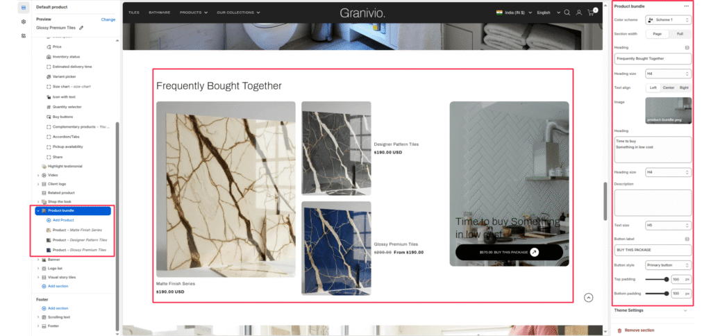
Blocks (Products) #
You can add individual products to the bundle by adding Product blocks in the left-hand sidebar.
Add Product #
Click “Add Product” to select a specific item from your store catalog.