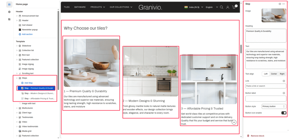
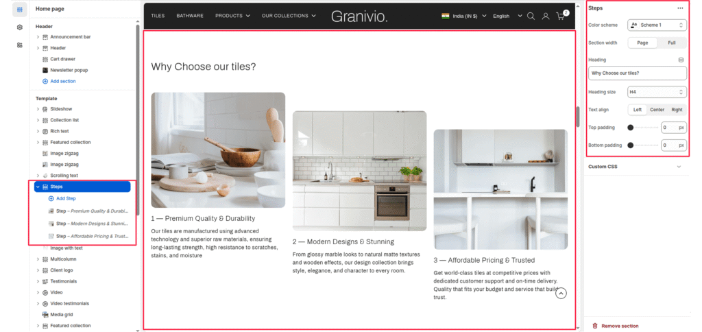
The Steps section is a structured layout designed to explain processes, company values, or “Why Choose Us” features using images and numbered text.
Section Settings #
Color scheme #
Choose the color scheme that matches your site design. This affects text and button colors over the section.
Section width #
Choose how wide the section appears on the page:
- Page—keeps the video within the page content width.
- Full—expands the video to full browser width.
Heading #
Add a main heading for the section.
Heading size #
Select a heading size from theme-defined options such as h1, h2, h3, h4, h5, and h6.
Text Align #
Controls the alignment of the section heading and text.
- Left
- Center
- Right
Top Padding / Bottom Padding #
Adjusts vertical spacing above and below the section.
Block Settings #
Each “Step” block represents a single column within the section:
Image #
Upload a visual representation for that specific step.
Heading
The name of the step.
Description #
The main paragraph or supporting text under the heading.
Text Align #
Controls the alignment of the section heading and text.
- Left
- Center
- Right
Button label #
Enter the call-to-action text for the button.
Button link #
Choose the link destination for the button (e.g., All Products collection or a custom URL).
Button Style #
Determines the design of the button.
- Primary button
- Secondary button
- Full button
- Link button
- Button with icon
- Button icon
Button icon enable #
Enable or disable an arrow icon inside the button.