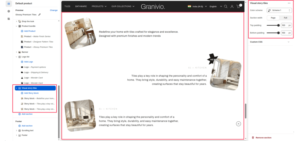
The Visual Story section allows you to present multiple “stories” or features in a unique zigzag layout. This is ideal for showcasing room inspirations, historical timelines, or key design philosophies.
Section Settings #
Color scheme #
Select a predefined color palette to match your theme’s aesthetic.
Section Width #
- Full: Stretches the section to the edges of the browser window.
- Page: Constrains the content to the theme’s maximum site width.
Top padding / Bottom padding #
Adjust vertical spacing above and below the section for consistent layout spacing.
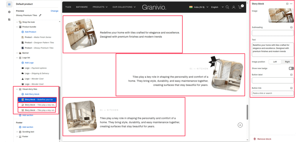
Blocks (Story block) #
Each story is added as an individual block that can be configured with its own media and text.
Image #
Upload a photo representing the story (e.g., a kitchen or living room interior).
Heading #
Enter a small tag or category name (e.g., “01—KITCHEN”).
Text #
Add the main body content for the story.
Image position #
Toggle between left and right to control which side of the text the image appears on.
Show new badge #
Enable this toggle to add a “NEW” call-out badge to the top corner of the image.
Button label & Link #
Add an optional call-to-action button to direct users to a specific page or collection.