- Blog Post
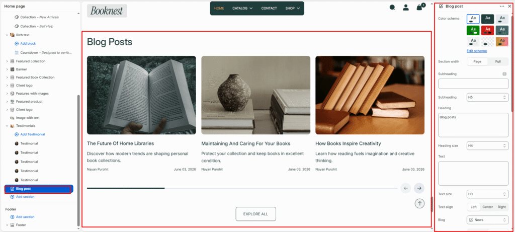
- Color scheme
- Section width
- Subheading
- Subheading size
- Heading
- Heading size
- Text
- Text size
- Button label
- Button link
- Button style
- Text alignment
- Blog
- Desktop layout
- Enable mobile slider
- Show navigation
- Show pagination
- Posts limit
- Desktop posts per row
- Mobile posts per row
- Show view all button
- View all button label
- Button style
- Top padding
- Bottom padding
- Post options
Blog Post #
The Blog Post section showcases recent articles or stories from your Shopify blog. It’s ideal for highlighting educational content, product tips, lifestyle insights, or brand news — helping you engage customers and improve SEO visibility.
Color scheme #
Select a predefined color palette to ensure the blog section blends seamlessly with your store’s theme.
Section width #
Choose how wide the section spans on the page.
Full: Stretches the section edge-to-edge across the browser window.
Page: Aligns section content with the page container.
Subheading #
Enter a small introductory text displayed above the heading.
Subheading size #
Choose the size of the subheading text (H1 to H6).
Heading #
Enter the main heading for the section.
Heading size #
Select the size of the heading text (H1 to H6).
Text #
Add descriptive rich text content for storytelling or brand messaging.
Text size #
Choose the size of the text content (H1 to H6).
Button label #
Enter the call-to-action button text.
Button link #
Select the destination page or URL for the button.
Button style #
Choose between available button styles. The styles depend on your theme’s design system.
- Primary button
- Secondary button
Text alignment #
Select the alignment of section content.
- Right
- Left
- Center
Blog #
Select which blog from your Shopify admin to display articles from.
Desktop layout #
Select between Grid or Slider layout for desktop view.
Enable mobile slider #
Enable or disable the slider for mobile devices to optimize small-screen navigation.
Show navigation #
Enable left and right arrows for manual slide navigation.
Show pagination #
Enable pagination dots at the bottom of the slider for quick slide position feedback.
Posts limit #
Set how many articles to show (between 2 and 20).
Desktop posts per row #
Choose how many posts appear per row on desktop (2–6 columns).
Mobile posts per row #
Choose how many posts appear per row on mobile (1–3 columns).
Show view all button #
Toggle ON to display a “View All” or “See All” button linking to the full blog page.
View all button label #
Customize the button text (e.g., SEE ALL).
Button style #
Choose between available button styles. The styles depend on your theme’s design system.
- Primary button
- Secondary button
Top padding #
Adds vertical space above the section content (value in pixels).
Bottom padding #
Adds vertical space below the section content (value in pixels).
Post options #
Show featured image #
Display the main image from each post.
Show tag #
Show blog tags above the title if available.
Show title #
Display the blog post’s title.
Show author #
Include the author’s name for credibility.
Show excerpt #
Display a short preview of the post content.
Show description #
Show the full or partial post description if needed.