The Article section is used for displaying a single blog post (article) page. It supports flexible layout options, sidebar customization, product recommendations, newsletter subscription, related posts, and comment features.
Color scheme #
Sets the overall color scheme for the article page — applies to the article body content area, comments form background, and general page typography. Choose a scheme that keeps the reading area clean and comfortable.
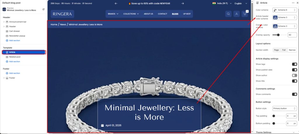
Article header color scheme #
Sets the color scheme applied specifically to the hero header area — the large featured image section at the top of the article page. This controls the overlay box colors and the title/metadata text that sits on top of the featured image.
Overlay color scheme #
Controls the color scheme of the translucent overlay layer applied over the featured image in the hero header. A darker overlay scheme improves readability of white text on bright or busy featured images.
Overlay opacity #
Controls how opaque the color overlay is over the hero featured image. A value of 0 makes the overlay fully transparent (image only). A value of 100 makes it fully solid. Adjust this in combination with the overlay color scheme to balance image visibility with text legibility.
Section width #
Controls how wide the article content area spans on the page.
- Page — content is constrained within the standard page container width.
- Full — content stretches edge to edge across the full browser width.
- Narrow — content is constrained to a narrower column, ideal for long-form reading.
Show tags #
When enabled, displays the blog post’s tags within the hero header overlay. Tags are assigned to articles in your Shopify blog post editor and help categorize content for readers.
Show publish date #
When enabled, shows the article’s published date in the hero header overlay. Useful for time-sensitive content such as news, announcements, or editorial posts.
Show author #
When enabled, displays the author’s name in the hero header overlay. The author name is pulled from the Shopify blog post’s author field. Disable for stores with a single-author blog where attributing authorship is unnecessary.
Show title #
When enabled, renders the article’s title prominently inside the hero header overlay box over the featured image. Disabling this hides the title from the hero area — useful if you prefer to display the title only within the article body content instead.
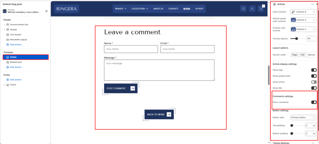
Button style #
Sets the visual style for the action buttons on the article page — including the Post Comment button and the Back to News navigation button. Choose Primary button for a solid filled style or Secondary button for an outlined variant, matching your site’s button design system.
Top padding #
Controls the vertical space added above the article section content. Increase this value to create more breathing room between the site header and the start of the hero image.
Bottom padding #
Controls the vertical space added below the article section content — after the Back to News button and before the footer. Adjust to ensure the page doesn’t feel cramped at the bottom.
Show comments #
When enabled, displays a Leave a comment form below the article content. The form includes Name, Email, and Message fields along with a Post Comment button. Comments must also be enabled at the blog level in Shopify Admin → Online Store → Blog posts → Manage blogs → Comments. Disable this toggle to hide the comments section entirely from the article page.