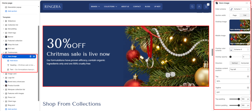
The hero image section displays a large visual banner with optional text content and app/theme blocks layered on top. Use it for promotions, announcements, or key landing messages.
Color scheme #
Choose a predefined color scheme to match the section’s text and overlay elements with the rest of the theme design.
Section width #
Control how wide the banner appears:
- Page: Keeps the banner within the page container width.
- Full: Spans edge-to-edge across the browser window for a full-width banner experience.
Desktop image #
Upload a high-quality banner image optimized for larger screens.
Mobile image #
Optionally upload a separate image optimized for mobile devices to ensure visual clarity and proper scaling.
Overlay opacity #
Adjust the dark overlay transparency on top of the banner image. This helps improve text readability and contrast.
Direction #
Choose how the content (title, text, buttons) is arranged.
- Vertical: Stacks elements top to bottom.
- Horizontal: Places elements side-by-side (ideal for wide banners).
Desktop content position #
Defines where the overlay content is positioned within the banner. Options typically include:
- Bottom right
- Top left
- Top center
- Top right
- Middle left
- Middle center
- Middle right
- Bottom left
- Bottom center
Top padding / Bottom padding #
Add vertical spacing above and below the banner content for better layout balance.
Tag #
Small highlight text shown above the main content area.
Tagline #
Secondary text shown under the tag.
Section Blocks #
You can enrich your banner with multiple content blocks to create a compelling visual + textual combo.