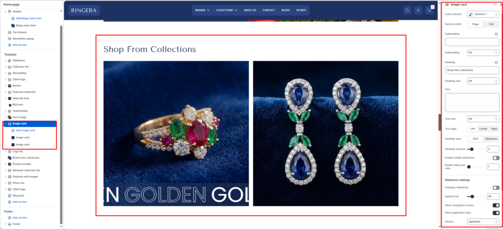
The Image Card section lets merchants display multiple promotional cards in either a grid or slideshow layout. Each card can include an image, heading, text, link, and button style options. This section works well for featured collections, campaigns, and brand storytelling.
Color scheme #
Applies your chosen theme color scheme to section backgrounds and text.
Section width #
Choose how wide the section spans on the page:
- Page – constrained to main content width.
- Full – spans the full browser width.
Subheading #
Enter a small introductory text displayed above the heading.
Subheading size #
Choose the size of the subheading text H1 To H6.
Heading #
Enter the main heading for the section.
Heading size #
Select the size of the heading text H1 To H6.
Text #
Add descriptive content to tell your brand story.
Text size #
Choose the size of the text content H1 To H6.
Text alignment #
Select the alignment of the content.
- Center
- Right
- Left
Desktop view #
Choose how cards are displayed on desktop: grid for a multi-column layout or slideshow for a swipeable slider layout.
Desktop columns #
Sets how many cards appear per row on desktop layouts. Supported range is 1 to 6.
Mobile slideshow #
When enabled, cards display as a slider on mobile devices (especially useful when desktop view is set to grid).
Mobile slides #
Controls the number of visible slides on mobile. Supported range is 1 to 3.
Autoplay slideshow #
Automatically rotates slides when slideshow mode is active.
Slideshow speed #
Controls slideshow autoplay speed using the section’s configured range (10 to 100).
Show navigation arrows #
Shows or hides previous and next navigation arrows in slideshow mode.
Show pagination dots #
Shows or hides slider pagination/progress indicators.
Source #
Lets you choose the content source mode: uploaded, url, or image.
Top padding #
Adds spacing above the section content.
Bottom padding #
Adds spacing below the section content.
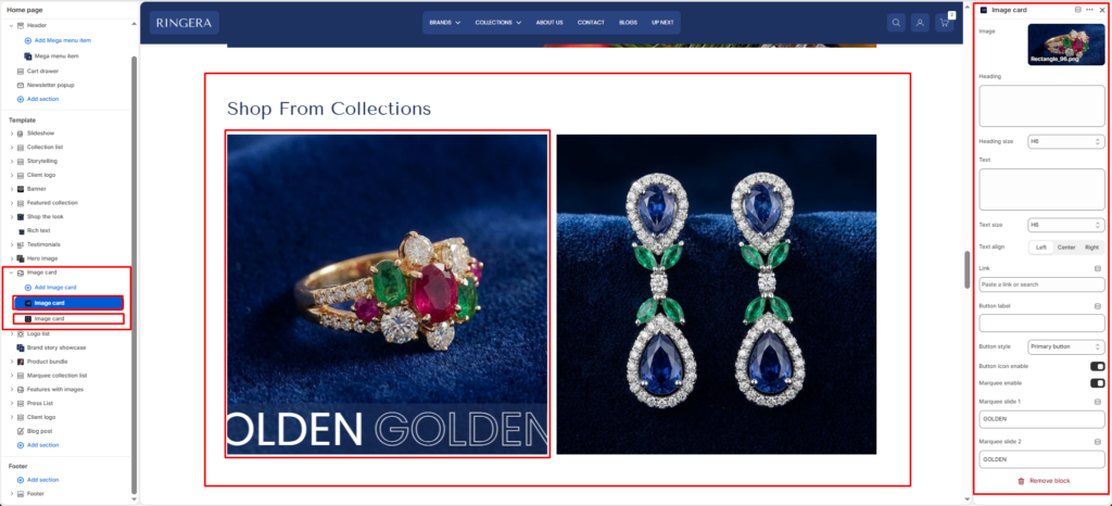
Block Settings #
Card image #
Upload or select the primary image for each image-card block.
Card heading #
Sets the card title text shown over or below the image (based on styling).
Card heading size #
Select card heading size from theme-defined options such as h1, h2, h3, h4, h5, h6.
Card text #
Adds a short supporting description for the card.
Card text size #
Select card text size from theme-defined options such as h1, h2, h3, h4, h5, h6.
Card text align #
Aligns card content to left, center, or right.
Card link #
Assign a destination URL for the card, such as a product, collection, page, or external link.
Button label #
Defines the call-to-action button text, for example Shop now.
Button style #
Select button style from available options: button-primary or button-secondary.
Button icon enable #
Shows or hides the arrow icon inside the button.
Marquee slide enable #
Enables scrolling marquee text overlay for the card.
Marquee slide 1 #
Sets the first marquee text value when marquee is enabled.
Marquee slide 2 #
Sets the second marquee text value when marquee is enabled.