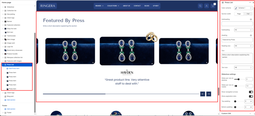
The Press List section is designed to showcase brand mentions, press features, or testimonials, typically displayed with a logo and a quote in a sleek slideshow format.
Color scheme #
Applies one of your theme color presets to the section background and typography.
Section width #
Chooses whether the section stays within page width or spans full width edge to edge.
Subheading #
Optional line above the main title, for example a category label.
Subheading size #
Sets the subheading scale using theme-defined options from h1 through h6.
Heading #
The main section title, such as “Our partners”.
Heading size #
Sets the heading scale using theme-defined options from h1 through h6.
Text #
Optional supporting copy under the heading.
Text size #
Sets the supporting text scale using theme-defined options from h1 through h6.
Text align #
Aligns the heading area to the left, center, or right.
Slideshow Settings #
Slides per row on desktop #
Use the slider to determine how many press items are visible at once on desktop screens.
Slides per row on mobile #
Use the slider to determine how many press items are visible at once on mobile devices.
Show navigation arrows #
Toggle on/off to display left and right arrows to control the slideshow.
Show pagination dots #
Toggle on/off to display dot indicators at the bottom of the slideshow.
Top padding #
Adjust the amount of space above the section using the slider (in pixels).
Bottom padding #
Adjust the amount of space below the section using the slider (in pixels).
Block Settings (Press Item) #
To add or edit individual press features, expand the Press List section on the left sidebar and click on a Press item block.
Logo/Image #
Upload the logo of the publication or press company.
Quote/Text #
Enter the quote, review, or excerpt from the press feature to display below the logo.
Link #
Add an optional URL to redirect users to the full press article or mention.