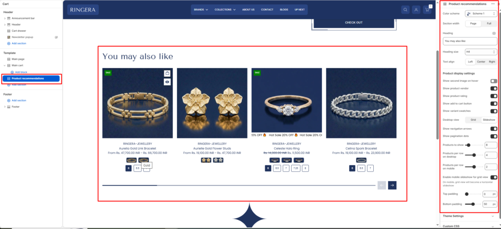
The Product Recommendations section automatically displays a curated list of related items to customers (e.g., “You may also like”). Shopify’s algorithm dynamically generates these recommendations based on the current product or cart contents to help increase order value.
Color scheme #
Choose a predefined color palette to match your store’s theme style.
Section width #
- Page: Constrains the section to the theme’s maximum site width.
- Full: Stretches the section to the edges of the browser window.
Heading #
Enter the title for this section.
Heading size #
Choose the size for the heading H1 To H6.
Text align #
Align the heading text to the Left, Center, or Right.
Product Display Settings #
Show second image on hover #
Toggle to replace the primary product image with the second image when a user’s mouse hovers over it.
Show product vendor #
Toggle to display the brand or vendor name above the product title.
Show product rating #
Toggle to display star ratings (requires a compatible product reviews app).
Show add to cart button #
Toggle to add a quick “Add to Cart” or “Select Options” button directly on the product card.
Show variant swatches #
Toggle to display color or material swatches directly on the product card.
Desktop view #
Choose between a standard Grid layout or an interactive Slideshow for desktop users.
Show navigation arrows #
Shows or hides previous and next controls when the section runs as a slideshow.
Show pagination dots #
Shows or hides the slideshow progress indicator.
Products to show #
Use the slider to set the maximum total number of recommended items to fetch and display (e.g., 8).
Products per row on desktop #
Choose how many product cards are displayed side-by-side on desktop screens (e.g., 4).
Products per row on mobile #
Choose how many product cards are displayed side-by-side on mobile screens (e.g., 2).
Enable mobile slideshow for grid view #
Toggle this on to convert the vertical mobile grid into a swipeable horizontal slideshow to save screen space.
Top padding #
Adjust the vertical spacing above the section (in pixels).
Bottom padding #
Adjust the vertical spacing below the section (in pixels).