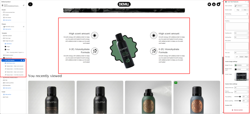
Icon Text Features #
The Icon text features section showcases key product benefits using icon-based feature points around a central visual. It is commonly used on product pages to communicate ingredients, performance highlights, or brand advantages in a quick, easy-to-scan layout.
Section Settings #
Color scheme #
Applies one of your theme color presets to the section background and typography.
Section width #
Chooses whether the section stays within page width or spans full width edge to edge.
Subheading #
Optional line above the main title, for example a category label.
Subheading size #
Sets the subheading scale using theme-defined options from h1 through h6.
Heading #
The main section title.
Heading size #
Sets the heading scale using theme-defined options from h1 through h6.
Text #
Optional supporting copy under the heading.
Text size #
Sets the supporting text scale using theme-defined options from h1 through h6.
Text align #
Aligns the heading area to the left, center, or right.
Top padding / Bottom padding #
Control vertical spacing above and below the section. Useful for maintaining consistent layout flow.
Center badge settings #
Configure the center visual area styling, such as background/accent colors and supporting image behavior.
Heading text color #
Set the color used for heading text in this section.
Description text color #
Set the color used for description/body text.
Center image #
Select the main product image shown in the middle of the feature layout.
Feature item settings #
Control default styling for feature items, including icon sizing and spacing behavior.
Icon width #
Set the width of feature icons (in pixels).
Icon position #
Choose where the icon appears relative to text content.