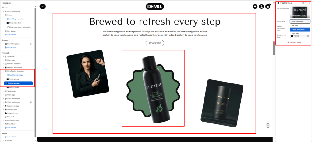
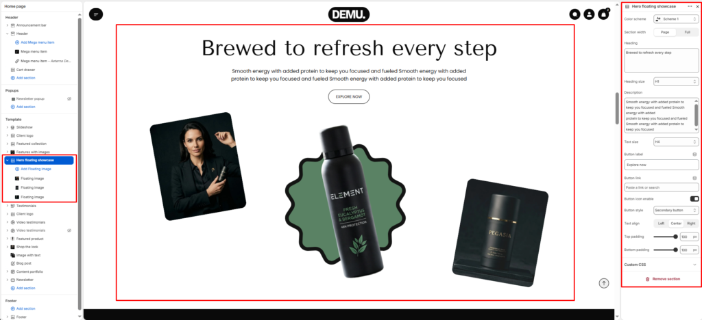
Hero Floating Showcase #
The Hero floating showcase section is designed to create a bold hero area with layered product visuals and supporting content. It combines a central heading, short descriptive text, optional call-to-action button, and floating decorative/product images to build a premium campaign-style presentation on the homepage.
Color scheme #
Choose the desired color palette for this section from the available theme schemes.
Section width #
Choose how wide the section spans on the page:
- Page: Aligns section content with the page container.
- Full: Stretches the section edge-to-edge across the browser window.
Heading #
Enter the main heading for the section.
Heading size #
Choose the size of the heading text H1 To H6.
Description #
Add supporting text below the heading.
Text size #
Select the size of the description text H1 To H6.
Text alignment #
Choose the alignment of the content.
- Left
- Center
- Right
Final bottom text #
Enter a concluding message displayed at the bottom of the section.
Top padding #
Adjust the space above the section.
Bottom padding #
Adjust the space below the section.
Block settings #
Main floating image block #
This block controls the primary center visual in the showcase layout. It is usually the most prominent product image and can be paired with a decorative background shape.
Decorative image #
Select the decorative background/shape image displayed behind the main floating product image.
Image style #
Choose a visual style preset for how the image appears (for example normal, framed, or alternate style options available in your theme).
Background image #
Upload/select the main product image displayed in the floating center area.
Floating image blocks #
Additional floating image blocks are used for side visuals (such as left and right product/lifestyle images) to complete the layered hero composition.