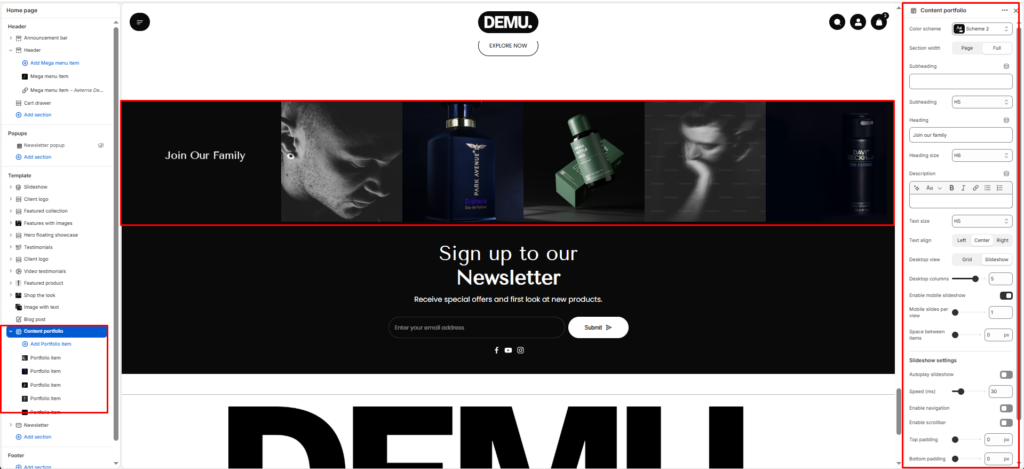
Content Portfolio #
The Content portfolio section displays a set of portfolio/media items in a grid or slideshow layout, with optional heading content (subheading, heading, description). It’s ideal for showcasing campaigns, collections, brand visuals, or featured content blocks.
Section Settings #
Color scheme #
Applies one of your theme color presets to the section background and typography.
Section width #
Chooses whether the section stays within page width or spans full width edge to edge.
Subheading #
Optional line above the main title, for example a category label.
Subheading size #
Sets the subheading scale using theme-defined options from h1 through h6.
Heading #
The main section title, such as “Our partners”.
Heading size #
Sets the heading scale using theme-defined options from h1 through h6.
Text #
Optional supporting copy under the heading.
Text size #
Sets the supporting text scale using theme-defined options from h1 through h6.
Text align #
Aligns the heading area to the left, center, or right.
Columns per row (desktop) #
Define how many columns appear side-by-side on desktop screens.
Common options: 2-4 columns per row.
Stack columns on mobile #
Enable this option to stack columns vertically on smaller devices for better readability and spacing.
Space between items #
Adjusts the gap between portfolio items (usually a slider).
Top padding / Bottom padding #
Control vertical spacing above and below the section. Useful for maintaining consistent layout flow.
Slideshow settings #
Autoplay #
Automatically rotates through slides.
Autoplay speed #
Controls how fast slides change (typically in seconds).
Disable navigation #
Hides previous/next arrows.
Enable pagination #
Shows pagination dots/indicators.