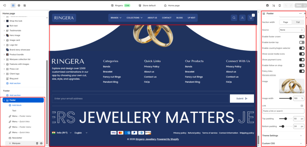
Footer #
The Footer section appears at the bottom of every page and is fully customizable from the Shopify theme editor. It supports a background image, color scheme, newsletter subscription, navigation menus, social icons, payment badges, and a logo image.
Color scheme #
Select the color scheme applied to the footer. This controls text colors, background, and button styles. Choose a scheme that contrasts well with the rest of your page — typically a dark scheme (e.g. Scheme 2) is used for the footer.
Section width #
Controls how wide the footer content spans across the browser window.
Full — content stretches edge to edge across the full browser width.
Page — content is constrained within the page’s max-width container.
Source #
Sets the background source type for the footer. Choose Image to display a background image, Video for an ambient video loop, or None for a plain color background defined by the color scheme.
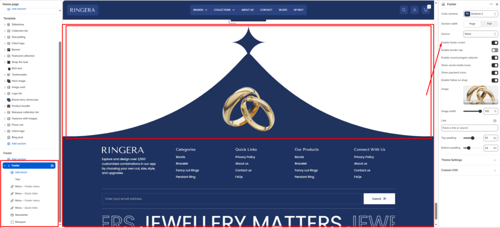
Enable footer crown #
Shows a decorative “crown” shape at the top edge of the footer — a curved or pointed ornamental divider that visually separates the footer from the section above it. Disable this for a clean flat edge.
Enable border top #
Adds a thin horizontal rule across the very top of the footer to create a subtle visual separation from the main page content. Useful when the footer crown is disabled.
Enable country/region selector #
Displays a dropdown in the bottom bar of the footer that allows customers to switch their country or region. Typically used for international stores to manage currency and shipping zones.
Show social media icons #
Renders clickable icons for your store’s social media profiles (e.g. Facebook, Instagram, Pinterest, YouTube). Social profile URLs are managed separately under Theme Settings → Social media.
Show payment icons #
Displays accepted payment method badges (e.g. Visa, Mastercard, PayPal, American Express, Diners Club, Discover) in the bottom bar of the footer. Enabled payment methods are automatically pulled from your Shopify Payments settings.
Enable follow on shop #
Adds a “Follow on Shop” button so customers can follow your store within the Shop app. Requires your store to be connected to the Shop channel.
Policy links #
Automatically renders links to your store’s legal policy pages (Privacy policy, Refund policy, Terms of service, Contact information, Shipping policy) in the bottom bar. Policy pages are managed under Settings → Policies in your Shopify admin.
Image #
Upload a logo or decorative image displayed within the footer. The recommended use is a secondary logo (e.g. a white/light version of your brand mark) that complements the footer’s color scheme. Set the Image width slider (1–100%) to control how large it appears. Optionally, add a Link URL to make the image clickable.
Top padding #
Controls the amount of vertical space added above the footer content. Increase this value to create more breathing room between the last section on the page and the footer’s top edge.
Bottom padding #
Controls the amount of vertical space added below the footer content, above the very bottom of the browser window. Adjust to ensure the bottom bar doesn’t feel cramped on large screens.
Footer Blocks #
Text #
A rich text block for adding your store name, brand tagline, or a short description. This block is typically placed in the leftmost column of the footer and sits above or alongside the logo image.
Menu — Footer menu #
A navigation column linked to a Shopify menu. Assign any menu you’ve created in Online Store → Navigation. Typically used for category links, quick links, product collections, or policy pages. Multiple menu blocks can be added to create separate columns (e.g. Categories, Quick Links, Our Products).
Menu — Quick links #
A second style of navigation column for shorter utility links. Functionally the same as the Footer menu block, but typically used for secondary navigation items such as FAQs, contact, or about pages. Adding multiple Menu blocks lets you build a multi-column footer layout.
Newsletter #
An email subscription form with an input field and a submit button. Customers who subscribe are added to your Shopify Email subscriber list. Customize the heading, placeholder text, and button label within the block settings.
Marquee #
A horizontally scrolling text ticker that displays a repeated phrase or slogan. This block adds a bold typographic accent at the bottom of the footer, before the policy/payment bar. Control speed, direction, and text content within the block settings.