- Color scheme
- Section width
- Image position
- Subheading
- Subheading size
- Heading
- Heading size
- Text
- Text size
- Text alignment
- Desktop view
- Desktop columns
- Mobile slides per view
- Enable mobile slideshow
- Show navigation arrows
- Show pagination dots
- Autoplay slideshow
- Top padding
- Bottom padding
- Block Settings (Testimonial Card)
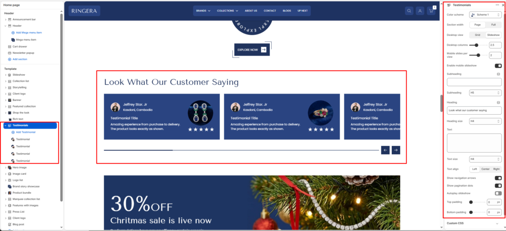
The Testimonials section is a powerful social proof tool that allows you to showcase customer reviews, photos, and ratings in a highly customizable slider or grid layout. It builds trust by pairing authentic customer feedback with the specific products they purchased.
Color scheme #
Choose the desired color palette for this section from the available theme schemes.
Section width #
Choose how wide the section spans on the page:
- Page: Aligns section content with the page container.
- Full: Stretches the section edge-to-edge across the browser window.
Image position #
Select the position of the image (Left or Right).
Subheading #
Enter a small introductory text displayed above the heading.
Subheading size #
Choose the size of the subheading text H1 To H6.
Heading #
Enter the main heading for the section.
Heading size #
Select the size of the heading text H1 To H6.
Text #
Add descriptive content to tell your brand story.
Text size #
Choose the size of the text content H1 To H6.
Text alignment #
Select the alignment of the content.
- Left
- Center
- Right
Desktop view #
Choose between a static Grid or an interactive Slideshow for desktop viewing.
Desktop columns #
Combine this slider (e.g., 2.5) with the Slideshow view to control how many testimonial cards are visible on the screen at once. Using a decimal (like 2.5) allows the next card to partially peek into view, encouraging users to scroll.
Mobile slides per view #
Use the slider to determine how many cards are visible simultaneously on mobile devices.
Enable mobile slideshow #
Toggle this on to convert a mobile grid layout into a swipeable carousel.
Show navigation arrows #
Toggle on to display left and right arrows for manual clicking.
Show pagination dots #
Toggle on to display the interactive dots at the bottom of the slider.
Autoplay slideshow #
Toggle on to make the testimonials scroll automatically without user interaction.
Top padding #
Adjust the vertical spacing above the section (in pixels).
Bottom padding #
Adjust the vertical spacing below the section (in pixels).
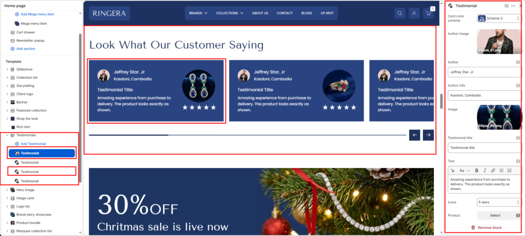
Block Settings (Testimonial Card) #
To add or edit individual customer reviews, expand the Testimonials section on the left sidebar and click on a Testimonial block.
Card color scheme #
Choose a specific color scheme just for this individual testimonial card. This is great for creating contrast against the section background.
Author image #
Upload a small profile picture or avatar of the customer.
Author #
Enter the customer’s name.
Author info #
Enter secondary information about the customer.
Image #
Upload a secondary image to display within the card. This is perfect for displaying User Generated Content a picture of the product they bought.
Testimonial title #
Add a bold, brief headline summarizing the review.
Text #
Use the rich text editor to enter the full customer quote. You can apply bold or italics within this field.
Icons #
Use the dropdown menu to select a visual star rating to display at the bottom of the card.
Product #
Select a specific item from your store catalog to associate with this review.