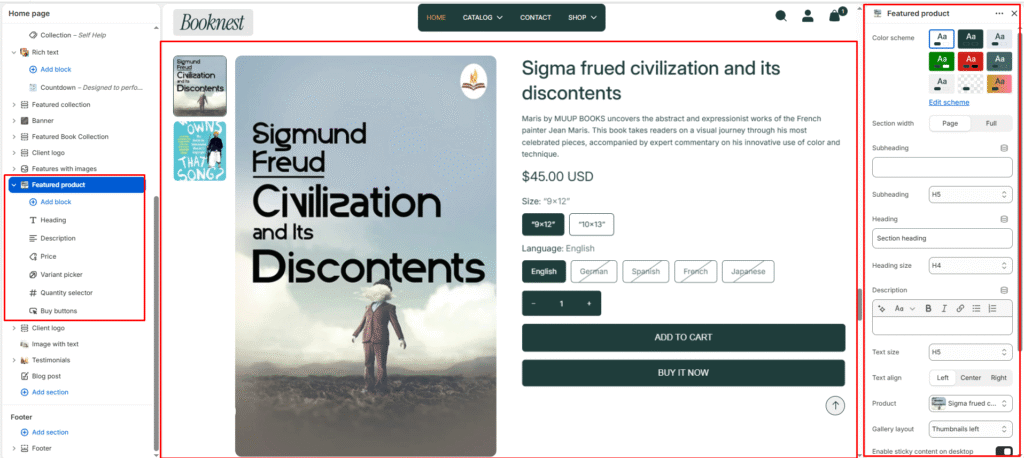
Featured Product #
The Featured Product section lets you spotlight a single product anywhere on your home page. It renders a full product experience — image gallery, title, price, variant pickers, quantity selector, and purchase buttons — without leaving the page. Content is assembled from customizable blocks so you can control exactly which product details appear and in what order.
Color scheme #
Choose a predefined color palette to match your store’s theme style.
Section width #
- Page: Constrains the section to the theme’s maximum site width.
- Full: Stretches the section to the edges of the browser window.
Subheading #
Enter a small introductory text displayed above the heading.
Subheading size #
Choose the size of the subheading text (H1 to H6).
Heading #
Enter the main heading for the section.
Heading size #
Select the size of the heading text (H1 to H6).
Text #
Add descriptive rich text content for storytelling or brand messaging.
Text size #
Choose the size of the text content (H1 to H6).
Text alignment #
Select the alignment of section content.
- Right
- Left
- Center
Product #
Select which product to feature in this section. Use the product picker to search and assign any active product from your Shopify catalog. The gallery, title, price, variants, and purchase buttons all update automatically based on the selected product.
Gallery layout #
Controls how the product image gallery and its thumbnail strip are arranged.
Stacked — all product images are stacked vertically, one below the other, without a thumbnail strip.
Thumbnails bottom — main image displayed above with a horizontal row of thumbnail images below it. Thumbnails left — thumbnails appear in a vertical column to the left of the main image.
Enable sticky content on desktop #
When enabled, the product information column (title, price, variants, and buttons) on the right side of the layout stays fixed (sticky) in the viewport as the customer scrolls down a tall image gallery on the left. This keeps the purchase controls visible at all times on desktop screens without the customer needing to scroll back up.
Top padding #
Controls the vertical spacing above the Featured Product section content. Increase this value to add more breathing room between the section above and the product layout.
Bottom padding #
Controls the vertical spacing below the Featured Product section content. Increase this value to add more space between the product layout and the section that follows it on the page.
Blocks #
Heading #
Displays the product title as the primary heading in the product information column. This is typically the first block in the stack. The title is pulled directly from the selected product’s name in Shopify.
Price #
Renders the product’s current price, compare-at price (if a sale is active), and per-unit price where applicable. Pricing is automatically managed by Shopify based on the product’s pricing settings and any active discounts.
Variant picker #
Displays the product’s variant options as selectable swatches or buttons. The picker automatically renders all variant options defined for the selected product. Customers must select all variants before the Add to Cart button activates. Variant images update the main gallery when a variant is selected.
Quantity selector #
Adds a quantity input control with decrement (−) and increment (+) buttons, allowing customers to choose how many units to add to the cart in a single action. The minimum quantity is 1. The maximum respects any inventory limits set on the product in Shopify.
Buy buttons #
Renders the primary purchase action buttons below the quantity selector. Includes two buttons — Add to Cart, which adds the product to the cart and opens the cart drawer, and Buy It Now, which takes the customer directly to the checkout page. The visual style of both buttons is inherited from the active color scheme.