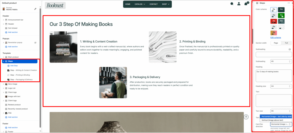
Steps #
Showcase a sequence of ordered steps or process cards (e.g., how your books are made, how to buy, or onboarding steps). Supports both grid and slider layouts with optional step numbers.
Color scheme #
Select a predefined color palette so the section blends seamlessly with your store’s theme.
Section width #
Choose Page width or Full width to control how wide the section spans across the screen.
Subheading #
Optional small label above the main heading.
Subheading size #
Choose the visual size for the subheading (H1–H6 style).
Heading #
Add a main title for the section.
Heading size #
Select how large the heading appears (H1–H6 style).
Text #
Optional description below the heading.
Text size #
Control the visual size of the description text.
Text alignment #
Select the alignment of the content.
- Left
- Center
- Right
Card direction #
Horizontal or vertical card layout.
Show step number #
Toggle to show numeric step indicator.
Desktop view #
Grid or slideshow on desktop.
Desktop columns #
Number of columns across desktop (1–4).
Mobile slideshow #
When enabled, grid converts to a swipeable slider on mobile.
Mobile slides #
Slides per view on small screens (1–3).
Autoplay #
Toggle automatic slide advance.
Slideshow speed #
Autoplay delay (slider speed).
Show navigation / Show pagination #
Controls visibility of arrows and progress/pagination.
Top padding / Bottom padding #
Adjust vertical spacing above and below the section (0–100px).
Block #
Image #
Optional visual for the step.
Image width #
Pixel width for the step image (80–400px).
Step label #
Short pre-heading.
Title #
Step title (primary heading for the card).
Text #
Short description (1–2 sentences recommended).
Link #
Select or paste a link to a product, collection, or page. Determines where the button redirects when clicked.
Button label #
The visible text is displayed on the button. Example: “Explore All Products” or “Shop Now.”
Button style #
Choose between available button styles. The styles depend on your theme’s design system.
- Primary button
- Secondary button