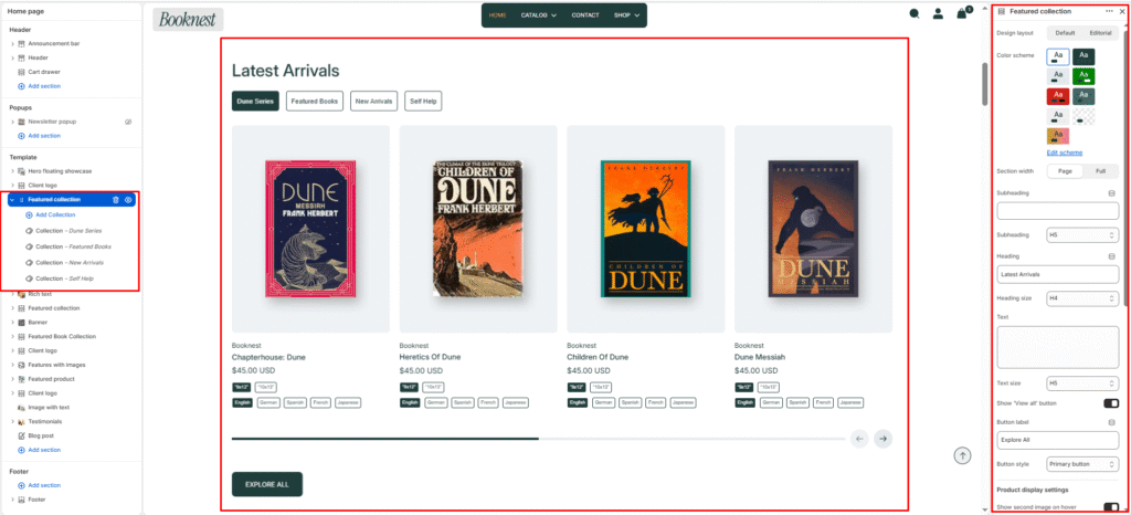
Featured Collection #
The Featured Collection section highlights products from one or more Shopify collections on your homepage or landing pages. It supports tabbed collection switching, grid or slideshow layouts, and quick-add functionality — ideal for showcasing new arrivals, bestsellers, genre collections, or seasonal picks.
This section includes 2 design layouts. Choose the layout that best fits your page structure.
Section settings #
Design layout #
Choose how the section is structured:
- Default — Heading and collection tabs sit above the product grid/slider. The View all button appears below the products for each tab.
- Editorial — Split two-column layout. Heading, tabs, and View all button sit on the left; products display on the right. Best for magazine-style homepage sections.
Color scheme #
Select a predefined color palette so the section blends seamlessly with your store’s theme.
Section width #
Choose Page width or Full width to control how wide the section spans across the screen.
Subheading #
Optional small label above the main heading.
Subheading size #
Choose the visual size for the subheading (H1–H6 style).
Heading #
Add a main title for the section (e.g., Latest Arrivals, Bestselling Books).
Heading size #
Select how large the heading appears (H1–H6 style).
Text #
Optional description below the heading (e.g., Discover our handpicked selection of must-read titles.).
Text size #
Control the visual size of the description text.
Show View all button #
Display a button linking to the full collection page.
Button label #
Text for the View all button (e.g., Explore All, Shop collection).
Button style #
Choose between Primary or Secondary button styling.
Product display settings #
Show second image on hover #
Display the product’s second image when customers hover over the card.
Desktop view #
- Grid — Static multi-column product layout.
- Slideshow — Horizontal product slider with navigation and pagination.
Show navigation #
Toggle previous/next arrow controls for the slideshow layout.
Show pagination #
Toggle the progressbar-style pagination indicator under the slider.
Show add to cart button #
Display a quick-add button on each product card so customers can add items without leaving the page.
Show product vendor #
Display the product vendor/author name on each card (e.g., publisher or author).
Show product rating #
Display star ratings on product cards when review data is available.
Show variant swatches #
Display colour or format swatches on product cards for quick variant preview.
Enable mobile slideshow for grid view #
When using Grid on desktop, products still scroll as a swipeable slider on mobile devices.
Products to show #
Set how many products to display per collection tab (2–50).
Products per row on desktop #
Choose how many product cards appear per row on desktop (2–6 columns).
Products per row on mobile #
Choose how many product cards appear per row on mobile (1–3 columns).
Top padding / Bottom padding #
Adjust vertical spacing above and below the section (0–100px).
Blocks — Collection #
Each Collection block adds one tabbed collection to the section. Add multiple blocks to create a tabbed interface (e.g., Fiction, Non-Fiction, New Arrivals, Self Help).
Tab label #
Custom label for the tab button. If left blank, the collection title is used automatically.
Collection #
Select the Shopify collection whose products will display in this tab.