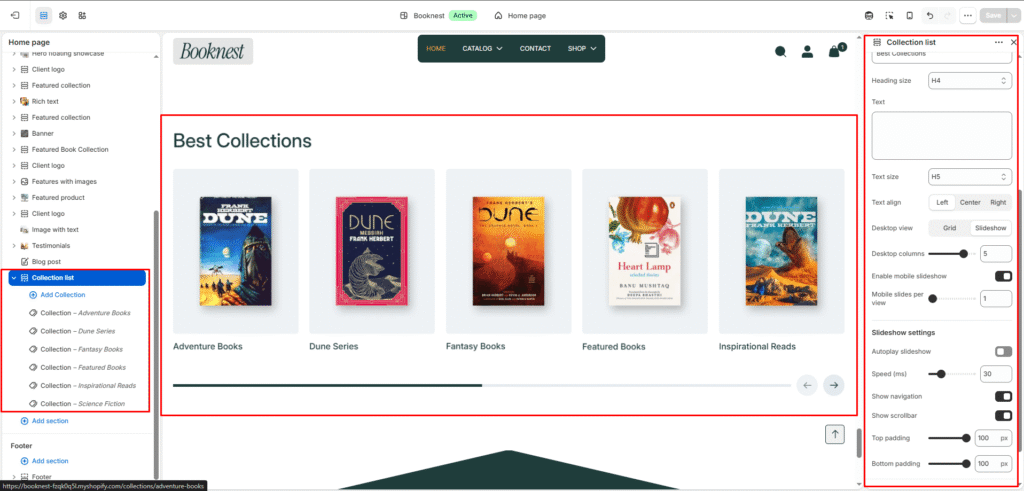
Collection List #
Collection List section allows merchants to display multiple collections in a visually engaging slider or grid layout. Each collection can feature a custom image, title, and link. Ideal for highlighting product categories or featured groups.
Color scheme #
Choose the desired color palette for this section from the available theme schemes.
Section width #
Choose how wide the section spans on the page:
- Page: Aligns section content with the page container.
- Full: Stretches the section edge-to-edge across the browser window.
Subheading #
Enter a short introductory text displayed above the heading.
Subheading size #
Choose the size of the subheading text (H1 to H6).
Heading #
Enter the main heading for the section.
Heading size #
Select the size of the heading text (H1 to H6).
Text #
Add supporting descriptive content for the testimonial area.
Text size #
Choose the size of the text content (H1 to H6).
Text alignment #
Set content alignment to Left, Center, or Right.
Layout #
Choose the layout that best suits your page’s design. There are two different modes to choose from for your store Grid/ Carousel.
Product View #
The maximum number of products per tab.
Desktop Grid Product View #
Adjust the Products per row slider/grid to specify the number of products to display within each row inside the section. The minimum number of of collections is, and the maximum is 5. This setting applies to desktop display devices.
Mobile Grid Product View #
Use the Products per row on mobile radio buttons to specify the number of products to display in each row inside the section. The options are 1 and 2. This setting applies to mobile display devices.
Enable mobile slideshow #
Select/deselect to enable the Swipe on Mobile.
Show navigation #
Toggle navigation arrow for slideshow controls.
Show pagination #
Toggle pagination dots for slideshow controls.
Top padding #
Add spacing above the section (in pixels).
Bottom padding #
Add spacing below the section (in pixels).
Block: Collection #
Each block represents one collection item in the slider or grid.
Collection #
Select the Shopify collection to be displayed.
Image #
Upload a custom image for this collection (recommended if you want a unique visual instead of the default collection image).
Collection title #
Enter a custom name for the collection display.
Collection URL #
Add the URL handle or custom link.