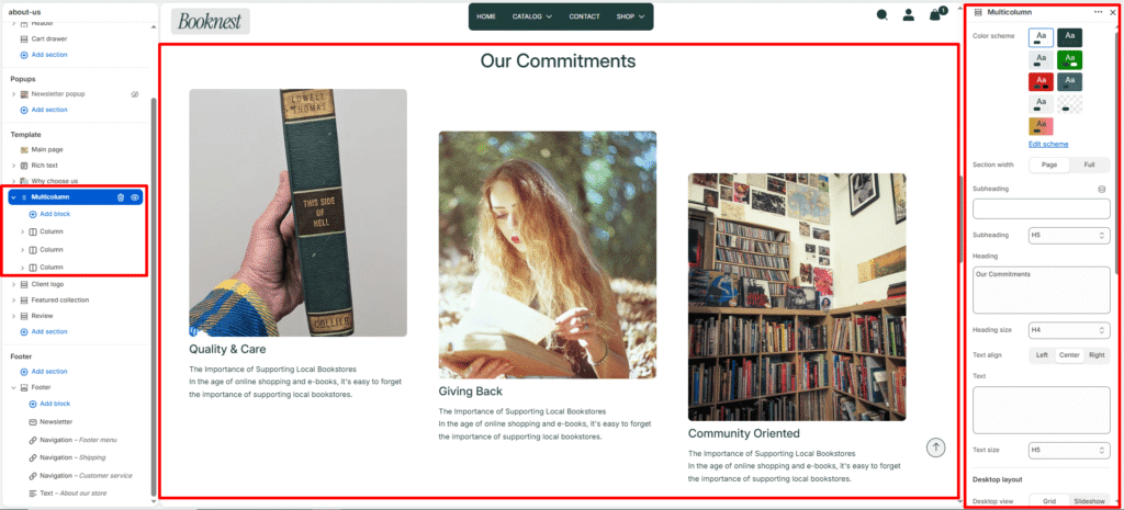
Multicolumn #
The Multicolumn section lets you showcase multiple content columns in a flexible grid or slideshow format. It’s ideal for feature cards, service highlights, benefits, product teasers, or any grouped content that needs equal-width columns.
Section settings #
Color scheme #
Sets the section’s background and accent styling.
Section width #
page-widthkeeps content contained.full-widthspans the full browser width.
Subheading #
Optional small label above the main heading.
Subheading size #
Choose heading level for the subheading (h1–h6).
Heading #
Main title for the section.
Heading size #
Controls the section heading font size (h1–h6).
Text #
Optional supporting description below the heading.
Text size #
Controls body text size (h1–h6).
Text align #
Aligns heading and text: left, center, or right.
Desktop layout #
Desktop view #
- grid — shows columns as a standard responsive grid.
- slideshow — shows columns within a slider on desktop.
Desktop columns #
Number of columns across desktop screens (1–6).
Editorial layout #
When enabled, columns are offset vertically in a staggered editorial style.
Adds visual variety by shifting columns down by an offset amount.
Editorial offset #
Controls vertical spacing for the editorial stagger effect.
Editorial columns gap #
Controls inner spacing between editorial columns.
Mobile layout #
Mobile slideshow #
- When enabled, mobile devices show the columns as a swipeable slider.
- When disabled, mobile uses a small grid layout instead.
Mobile slides #
Number of columns visible per slide on mobile (1–3).
Slideshow settings #
Autoplay #
Automatically advance slides when enabled.
Slideshow speed #
Sets autoplay delay.
Show navigation #
Displays previous/next arrow controls.
Show pagination #
Displays progress/pagination indicators.