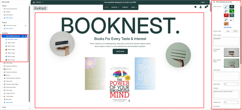
Hero Floating Showcase #
The Hero Floating Showcase section is a premium homepage hero designed to make a strong first impression. It combines a large brand heading, decorative floating side images, centered promotional copy with a call-to action button, and a bottom image carousel — perfect for promoting new book releases, bestsellers, author spotlights, or seasonal campaigns.
Color scheme #
Select a predefined color palette so the hero blends seamlessly with your store’s theme.
Section width #
Choose Page width or Full width to control how wide the section spans across the screen.
Main heading #
Add a large display title at the top of the section (e.g., BOOKNEST.). This is the primary brand or campaign headline and supports line breaks for stacked text.
Left floating image #
Upload a decorative image that appears on the left side of the hero area. Ideal for book covers, author portraits, or lifestyle visuals that frame the main content.
Right floating image #
Upload a decorative image that appears on the right side of the hero area. Use it to balance the layout with a second cover, product, or editorial image.
Subheading #
Optional small label above the main heading (e.g., New arrivals, Featured author).
Subheading size #
Choose the visual size for the subheading (H1–H6 style).
Heading #
Add the main promotional title below the floating images (e.g., Books For Every Taste & Interest).
Heading size #
Select how large the heading appears (H1–H6 style).
Description #
Write a short supporting paragraph that explains your offer or brand message (e.g., a brief intro about your bookstore or current promotion).
Description size #
Control the visual size of the description text.
Button label #
Text for the call-to-action button (e.g., Shop now, Explore collection).
Button link #
Link the button to a collection, product, page, or any URL.
Button style #
Choose between Primary or Secondary button styling to match your call-to-action hierarchy.
Text alignment #
Align the heading, description, and button to Left, Center, or Right.
Slideshow settings #
Show navigation #
Toggle previous/next arrow controls for the bottom image carousel.
Show pagination #
Toggle pagination dots under the carousel to indicate slide position.
Autoplay slideshow #
Enable automatic slide rotation for the bottom carousel. Disable if you prefer manual navigation only.
Blocks — Slide image #
Each Slide image block adds one image to the bottom carousel slider.
Image #
Upload the slide image (typically book covers, featured titles, or promotional visuals). Add multiple blocks to build a multi-slide showcase.
Top padding / Bottom padding #
Adjust vertical spacing above and below the entire section (0–100px) to control how much breathing room it has relative to neighbouring sections.