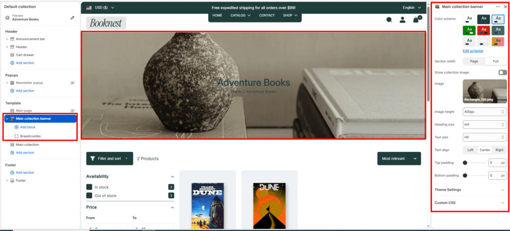
Main Collection Banner #
The Main Collection Banner section displays the banner area at the top of a collection page. It helps highlight the collection name, image, and breadcrumbs, giving customers clear context about what collection they are viewing.
Color scheme #
Choose a predefined color palette from your theme settings to match the banner background and text colors.
Section width #
Controls how wide the banner section appears on the page.
- Page: Matches the site’s default content width.
- Full: Extends the banner to the full browser width for an immersive layout.
Show collection image #
Toggle ON/OFF to display the featured image of the current collection as the banner background.
Image #
Upload or select a custom image to display in the banner. If no image is chosen, the collection’s featured image (if available) will be used by default.
Image height #
Image height is controls the featured article image height at the top of the page.
- Adapt to image (
auto) (default): uses the image’s natural height (best when your blog images are consistent). - Fixed heights:
300px,400px,500px,600px.
Heading size #
Choose the heading tag (H1-H6) for the collection title. Typically set to H2 for consistency across pages.
Text size #
Sets the size of the subheading or breadcrumb text. Commonly H5 for secondary text.
Text align #
Aligns banner text content (left, center, or right).
Top padding #
Adds space above the banner content (in pixels).
Bottom padding #
Adds space below the banner content (in pixels).