Contact Form #
The Contact form section allows customers to reach out directly through your website. It includes customizable text content, contact fields, and optional image and info blocks for better presentation.
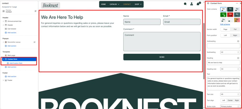
Section Settings #
Color scheme #
Choose the desired color palette for this section from the available theme schemes.
Section width #
Choose how wide the section spans on the page:
- Page: Aligns section content with the page container.
- Full: Stretches the section edge-to-edge across the browser window.
Form position #
Left or right alignment of the form versus section details.
Subheading #
Enter a small introductory text displayed above the heading.
Subheading size #
Choose the size of the subheading text H1 To H6.
Heading #
Enter the main heading for the section.
Heading size #
Select the size of the heading text H1 To H6.
Text #
Add descriptive content to tell your brand story.
Text size #
Choose the size of the text content H1 To H6.
Text alignment #
Select the alignment of the content.
- Right
- Left
- Center
Button style #
Lets you select a predefined button style.
- Primary Button
- Secondary Button
Top padding #
Adds vertical space above the section content. Value in pixels.
Bottom padding #
Adds vertical space below the section content. Value in pixels.
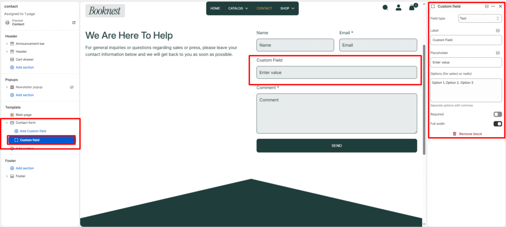
Blocks Custom fields #
Each custom_field block adds one extra form input. Block settings:
- Field type:
text,textarea,phone,select,checkbox,radio. - Label: Field label shown to users.
- Placeholder: Input placeholder text.
- Options: Comma-separated options for
selectorradio. - Required: Toggle to make the field mandatory (adds
required+aria-required). - Full width: Toggle whether the field spans full row or half-width.