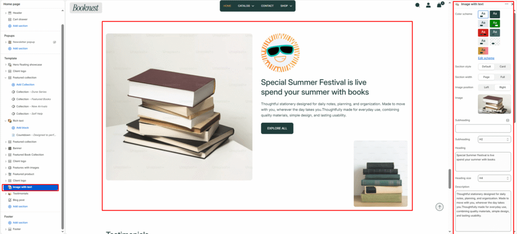
Image with text #
The Image with Text section combines a strong visual image with supporting copy and a CTA button. It’s perfect for editorial storytelling, product highlights, brand messaging, or any content block where an image and text should appear side by side.
Section settings #
Color scheme #
Choose a predefined color palette to match the section with your store theme style.
Section style #
default— standard split layout.card— adds a card-style background using the selected card color scheme.
Card colour scheme #
- Visible only when
Section styleis set tocard. - Controls the card background and accent styling.
Section width #
Select how wide the section appears on the page. Page width keeps the content inside the site container, while Full width stretches the section edge-to-edge.
Image position #
Controls the layout direction by placing the primary image on the left or right side of the text content.
Image #
Upload the main visual shown in the section. If no image is selected, the theme displays a placeholder.
Subheading #
Enter a small introductory text displayed above the heading.
Subheading size #
Choose the size of the subheading text (H1 to H6).
Heading #
Add the main title text that appears in the content area.
Heading size #
Adjust heading size using theme-defined options such as h1, h2, h3, h4, h5, h6.
Description #
Enter supporting paragraph text to explain the message, promotion, or section context.
Text size #
Select text size from theme-defined options such as h1, h2, h3, h4, h5, h6.
Button label #
Set the call-to-action button text, for example Shop now or Learn more.
Button link #
Choose where the button should redirect, such as a collection, product, page, or custom URL.
Button style #
Choose the button style from available options.
- Button Primary
- Button Secondary
Button icon enable #
Enable button icon.
Small image #
Upload an optional secondary image that appears as an accent visual in the content area.
Top padding #
Adjust the spacing above the section content.
Bottom padding #
Adjust the spacing below the section content.
Spinning Badge #
Enable badge #
Toggles an optional decorative badge overlay.
Badge image #
Upload a badge graphic when Enable badge is enabled.
Badge color from / to #
Gradient colors for the badge decoration.
Badge size #
Controls badge scale using viewport width units.
Badge speed #
Controls badge animation speed.