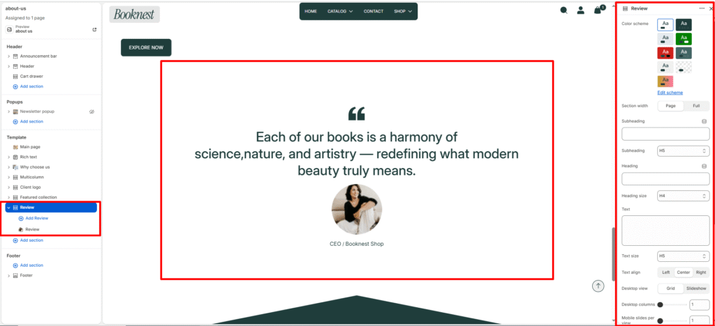
Review #
Show customer reviews or testimonials in a card-style layout (grid or slideshow) to build trust and social proof.
Section Settings #
Color scheme #
Select a predefined color palette so the section blends seamlessly with your store’s theme.
Section width #
Choose Page width or Full width to control how wide the section spans across the screen.
Subheading #
Optional small label above the main heading.
Subheading size #
Choose the visual size for the subheading (H1–H6 style).
Heading #
Add a main title for the section.
Heading size #
Select how large the heading appears (H1–H6 style).
Text #
Optional description below the heading.
Text size #
Control the visual size of the description text.
Desktop view #
grid or slideshow (slider on desktop).
Columns (desktop) #
Number of review cards per row (1–4).
Columns (mobile) #
Number of slides/columns on mobile (1–3).
Mobile slideshow for grid #
If enabled, grid mode can become a swipeable slider on mobile.
Slider controls #
Autoplay (toggle), navigation arrows, and pagination/progress bar options.
Blocks #
Card color scheme #
Card-level color preset.
Icon #
Choose display icon — none, quote, or star ratings (5-stars..1-star).
Review text #
The quoted review or testimonial content.
Author image #
Optional author/avatar image.
Author #
Name or role of the reviewer.
Author info #
Additional info such as company, location, or title.