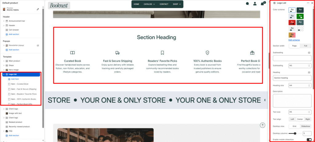
Logo List #
The Logo List section displays a row or carousel of icon-based brand/features cards. It’s ideal for showing trusted partners, key service benefits, feature highlights, or product qualities using an icon, title, and short description.
Section settings #
Color scheme #
Select a predefined color palette so the section blends seamlessly with your store’s theme.
Section width #
Choose Page width or Full width to control how wide the section spans across the screen.
Subheading #
Optional small label above the main heading.
Subheading size #
Choose the visual size for the subheading (H1–H6 style).
Heading #
Add a main title for the section.
Heading size #
Select how large the heading appears (H1–H6 style).
Text #
Optional description below the heading.
Text size #
Control the visual size of the description text.
Text align #
Aligns the heading and paragraph: left, center, or right.
Desktop view #
grid— shows icons in a responsive grid.slideshow— shows items in a slider on desktop.
Desktop columns #
Number of items displayed per row on desktop (2–8).
Mobile slideshow #
If enabled, grid mode becomes a swipeable slider on mobile.
Mobile slides #
Number of items visible on mobile slides (1–4).
Item gap #
Space between logo cards.
Icon size #
Size of the icon/image container (24–120px).
Autoplay #
Automatically advance slides when the slider is active.
Slideshow speed #
Delay for autoplay.
Show navigation #
Toggle previous/next arrows.
Show pagination #
Toggle progress/pagination indicators.
Padding top / bottom #
Vertical spacing around the section.
Blocks #
Icon image #
Upload a custom logo or icon graphic.
Fallback icon #
Use built-in icon symbols when no custom image is provided.
Title #
Main label for the item.
Description #
Short supporting text.
Link #
Optional URL for the item card.