Table of Contents
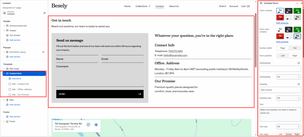
A ready-to-use contact form with configurable fields, paired with optional text, image, and map content.
Section settings #
- Color scheme: Choose which color scheme (defined in Theme settings → Colors) this element uses.
- Form color scheme: Choose which color scheme (defined in Theme settings → Colors) this element uses.
- Section width: Choose from: “Page”, “Full”.
- Form position: Choose from: “Left”, “Right”.
- Subheading: Enter the text you want to display.
- Subheading: Choose from: “H1”, “H2”, “H3”, “H4”, “H5”, “H6”.
- Heading: Enter the text you want to display.
- Heading size: Choose from: “H1”, “H2”, “H3”, “H4”, “H5”, “H6”.
- Text: Enter a longer block of plain text.
- Text size: Choose from: “H1”, “H2”, “H3”, “H4”, “H5”, “H6”.
- Text align: Choose from: “Left”, “Center”, “Right”.
Contact form header #
- Subheading: Enter the text you want to display.
- Subheading: Choose from: “H1”, “H2”, “H3”, “H4”, “H5”, “H6”.
- Heading: Enter the text you want to display.
- Heading size: Choose from: “H1”, “H2”, “H3”, “H4”, “H5”, “H6”.
- Text: Enter a longer block of plain text.
- Text size: Choose from: “H1”, “H2”, “H3”, “H4”, “H5”, “H6”.
Contact form content header #
- Subheading: Enter the text you want to display.
- Subheading: Choose from: “H1”, “H2”, “H3”, “H4”, “H5”, “H6”.
- Heading: Enter the text you want to display.
- Heading size: Choose from: “H1”, “H2”, “H3”, “H4”, “H5”, “H6”.
- Text: Enter a longer block of plain text.
- Text size: Choose from: “H1”, “H2”, “H3”, “H4”, “H5”, “H6”.
- Button style: Choose from: “Primary button”, “Secondary button”, “Outline”, “Link”.
- Top padding: Fine-tune this value with the slider (from 0 to 100px).
- Bottom padding: Fine-tune this value with the slider (from 0 to 100px).
Info block #
- Icon: Choose from: “None”, “Address”, “Clock”, “Filled meassage”, “Filled support”, “Avatar”, “Chat”, “Comment”, “Customer support”, “Envelope”, “Mobile phone”, “Operator”, “Phone”, “Send”, “User”, “Email”, “Location”.
- Icon: Upload or select an image to display.
- Heading: Enter the text you want to display.
- Text: Add formatted text — supports bold, italic, links, and lists.
Custom field block #
- Field type: Choose from: “Text”, “Textarea”, “Phone”, “Select”, “Checkbox”, “Radio”.
- Label: Enter the text you want to display.
- Placeholder: Enter the text you want to display.
- Options (for select or radio): Separate options with commas
- Required: Turns the “Required” option on or off.
- Full width: Turns the “Full width” option on or off.