Table of Contents
- Section settings
- @app block
- Text block
- Heading block
- Price block
- Quantity selector block
- Description block
- Volume pricing table block
- Variant picker block
- SKU block
- Size chart block
- Product rating block
- Pickup availability block
- Inventory status block
- Buy buttons block
- Complementary products block
- Trust badges block
- Custom liquid block
- Share block
- Icon with text block
- Accordion/tabs block
- Estimated delivery time block
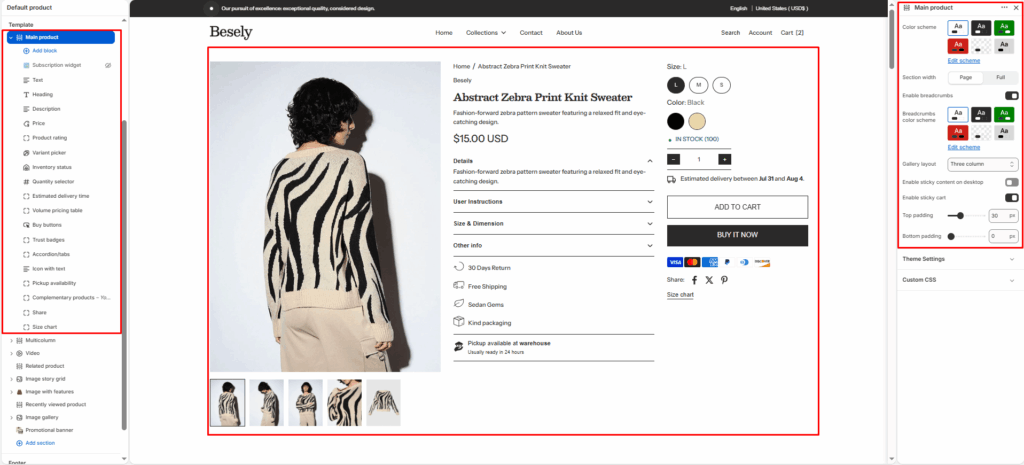
The main product page template — controls the media gallery, price, variant picker, add-to-cart, and product information tabs.
Section settings #
- Color scheme: Choose which color scheme (defined in Theme settings → Colors) this element uses.
- Section width: Choose from: “Page”, “Full”.
- Enable breadcrumbs: Switch this on to activate breadcrumbs.
- Breadcrumbs color scheme: Choose which color scheme (defined in Theme settings → Colors) this element uses.
- Gallery layout: Choose from: “Grid”, “Thumbnails bottom”, “Thumbnails left”, “Slideshow”, “Three column”.
- Enable sticky content on desktop: Switch this on to activate sticky content on desktop.
- Enable sticky cart: Switch this on to activate sticky cart.
- Top padding: Fine-tune this value with the slider (from 0 to 100px).
- Bottom padding: Fine-tune this value with the slider (from 0 to 100px).
@app block #
Text block #
- Text: Configure this option to control the setting’s behavior.
Heading block #
Price block #
Quantity selector block #
Description block #
Volume pricing table block #
Variant picker block #
SKU block #
Size chart block #
- Size chart page: Select a page to link or pull content from.
Product rating block #
To display a rating, add a product rating app. [Learn more](https://help.shopify.com/manual/online-store/themes/theme-structure/page-types#product-rating-block)
Pickup availability block #
Inventory status block #
- Low inventory threshold: Choose 0 to always show in stock if available.
- Show inventory count: Displays inventory count when this is switched on.
Buy buttons block #
- Show dynamic checkout buttons: Using the payment methods available on your store, customers see their preferred option, like PayPal or Apple Pay. [Learn more](https://help.shopify.com/manual/using-themes/change-the-layout/dynamic-checkout)
- Show recipient information form for gift cards: Allows buyers to send gift cards on a scheduled date along with a personal message. [Learn more](https://help.shopify.com/manual/online-store/themes/customizing-themes/add-gift-card-recipient-fields)
Complementary products block #
- Limit: To select complementary products, add the Search and Discovery app. [Learn more](https://help.shopify.com/manual/online-store/search-and-discovery/product-recommendations)
- Heading: Enter the text you want to display.
Trust badges block #
Custom liquid block #
- Custom liquid: Insert custom Liquid code for advanced customization.
Share block #
- Share label: Enter the text you want to display.
Icon with text block #
- Icon with text layout: Choose from: “Horizontal”, “Vertical”.
- Icon 1: Upload or select an image to display.
- Text 1: Enter the text you want to display.
- Icon 2: Upload or select an image to display.
- Text 2: Enter the text you want to display.
- Icon 3: Upload or select an image to display.
- Text 3: Enter the text you want to display.
- Icon 4: Upload or select an image to display.
- Text 4: Enter the text you want to display.
Accordion/tabs block #
- Color scheme: Choose which color scheme (defined in Theme settings → Colors) this element uses.
- Layout type: Choose from: “Accordion”, “Tabs”.
- Default open item: Fine-tune this value with the slider.
- Heading 1: Enter the text you want to display.
- Content source for 1st item: Choose from: “Product description”, “Custom text”.
- Custom content (for 1st item): Add formatted text — supports bold, italic, links, and lists.
- Heading 2: Enter the text you want to display.
- Content 2: Add formatted text — supports bold, italic, links, and lists.
- Heading 3: Enter the text you want to display.
- Content 3: Add formatted text — supports bold, italic, links, and lists.
- Heading 4 (rating): Enter the text you want to display.
- Content 4: Add formatted text — supports bold, italic, links, and lists.
Estimated delivery time block #
To customize message for each product, create a metafield with the key ‘custom.delivery_date_message’ and type ‘Rich text’.
- Hide when pre-order is enabled: Hides when pre-order is enabled when this is switched on.
- Message: You can use these codes in the message: earliest_delivery_date to show earliest delivery date. latest_delivery_date to show latest delivery date.
Delivery settings #
- processing_days: Fine-tune this value with the slider.
- Minimum shipping days: Fine-tune this value with the slider.
- Maximum shipping days: Fine-tune this value with the slider.
- Skip weekends in calculation: Turns the “Skip weekends in calculation” option on or off.