Table of Contents
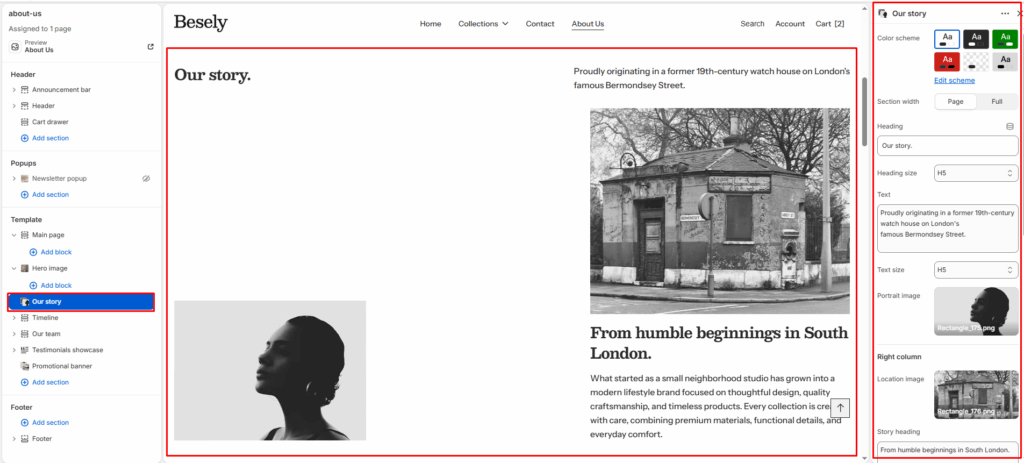
A storytelling section for sharing your brand’s background, mission, or history, combining image and text.
Section settings #
- Color scheme: Choose which color scheme (defined in Theme settings → Colors) this element uses.
- Section width: Choose from: “Page”, “Full”.
- Heading: Enter the text you want to display.
- Heading size: Choose from: “H1”, “H2”, “H3”, “H4”, “H5”, “H6”.
- Text: Enter a longer block of plain text.
- Text size: Choose from: “H1”, “H2”, “H3”, “H4”, “H5”, “H6”.
- Portrait image: Upload or select an image to display.
Right column #
- Location image: Upload or select an image to display.
- Story heading: Enter a longer block of plain text.
- Heading size: Choose from: “H1”, “H2”, “H3”, “H4”, “H5”, “H6”.
- Text: Enter a longer block of plain text.
- Text size: Choose from: “H1”, “H2”, “H3”, “H4”, “H5”, “H6”.
Button #
- Button label: Enter the text you want to display.
- Button link: Link this element to a page, product, collection, blog, or external URL.
- Button style: Choose from: “Primary button”, “Secondary button”, “Outline”, “Link”.
- Top padding: Fine-tune this value with the slider (from 0 to 100px).
- Bottom padding: Fine-tune this value with the slider (from 0 to 100px).