

Blog Post
On this page
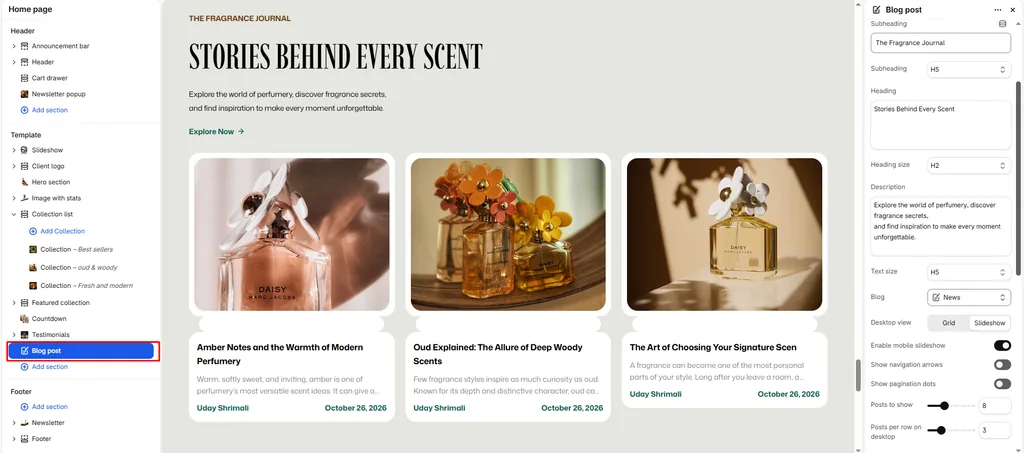
The Blog Post section allows you to feature curated stories, fragrance guides, scent layering tutorials, and perfume house news directly on any page of your store (such as the Homepage, About page, or custom landing pages).
It features a dual-mode display (Static Grid or Interactive Carousel), touch swipe optimization on mobile devices, granular metadata toggles, and customizable call-to-action buttons.
How to Access Blog Post Section Settings
- From your Shopify Admin, navigate to Online Store > Themes.
- Click Customize on the Attar theme.
- Open the page template where you want to add the section (e.g., Home page).
- In the left sidebar, click Add section and select Blog posts.
- Configure your layout, post limits, and article card options.
- Click Save.
Layout & Heading Settings
| Setting Name | Type | Options / Range | Default | Description |
|---|---|---|---|---|
| Color scheme | Color Scheme Picker | Any configured color scheme | Scheme 1 | Sets the background and typography color palette for the section. |
| Section width | Dropdown | Page width, Full width | Page width | Controls whether the section stays within the site container or spans edge-to-edge. |
| Subheading | Text | e.g., “The Fragrance Journal” | Subheading | Small uppercase label above the main heading. |
| Subheading size | Dropdown | H1 – H6 | H5 | Sets the typography size hierarchy for the subheading. |
| Heading | Textarea | e.g., “Stories Behind Every Scent” | Blog posts | The main headline displayed above the article cards. |
| Heading size | Dropdown | H1 – H6 | H4 | Sets the typography size hierarchy for the section heading. |
| Description | Textarea | Formatted text | None | Optional introduction or context displayed beneath the main heading. |
| Text size | Dropdown | H1 – H6 | H3 | Sets the font size of the description text. |
| Blog | Blog Picker | Select any active Shopify blog | None | Chooses which blog to pull articles from (e.g., News, Scent Journal, or Fragrance Guides). |
Grid & Slideshow Display Controls
| Setting Name | Type | Options / State | Default | Description |
|---|---|---|---|---|
| Desktop view | Dropdown | Grid, Slideshow | Grid | Choose between a classic multi-column article grid or a horizontal slider on desktop screens. |
| Mobile slideshow for grid | Checkbox | Enabled / Disabled | Enabled | Enables smooth horizontal swipe gesture scrolling on mobile smartphones. |
| Show navigation | Checkbox | Enabled / Disabled | Enabled | Displays previous/next slider arrows (active when Slideshow mode is selected). |
| Show pagination | Checkbox | Enabled / Disabled | Enabled | Displays clickable pagination dots beneath the slider. |
Posts Density & “View All” Button
| Setting Name | Type | Options / Range | Default | Description |
|---|---|---|---|---|
| Posts limit | Slider / Range | 2 – 20 (Step: 1) | 6 | The maximum number of recent articles displayed in the section. |
| Desktop posts per row | Slider / Range | 2 – 6 (Step: 1) | 3 | Number of article cards displayed side-by-side on desktop screens. |
| Mobile posts per row | Slider / Range | 1 – 3 (Step: 1) | 1 | Number of article cards visible on mobile screens before swiping. |
| Show view all | Checkbox | Enabled / Disabled | Enabled | Displays a call-to-action button linking directly to the full blog archive page. |
| Button label | Text | e.g., “Explore All Stories” | Button label | The text displayed on the link button. |
| Button style | Dropdown | Button primary, Button secondary, Button link | Button primary | Chooses the visual button styling. |
| Top padding | Slider / Range | 0px – 200px (Step: 5px) | 100px | Top vertical whitespace above the section content. |
| Bottom padding | Slider / Range | 0px – 100px (Step: 1px) | 100px | Bottom vertical whitespace below the section content. |
Article Card Content Toggles
Customize which information displays on each article card:
| Setting Name | Type | Default | Description |
|---|---|---|---|
| Show image | Checkbox | Enabled | Displays the article’s featured hero image. |
| Show title | Checkbox | Enabled | Shows the article title. |
| Show tag | Checkbox | Disabled | Displays the primary category tag pill (e.g., Scent Guide, Oud & Amber). |
| Show date | Checkbox | Enabled | Displays the date the article was published. |
| Show author | Checkbox | Enabled | Displays the writer or perfumer’s byline. |
| Show excerpt | Checkbox | Enabled | Displays a short summary preview of the article copy. |
| Show description | Checkbox | Disabled | Outputs full body copy if an excerpt is not specified. |
Pro Tips for Attar Stores
- Feature Editorial Stories on the Homepage: Place this section near the bottom of your homepage with Desktop view set to
Slideshowand Desktop posts per row set to3. It creates an engaging magazine-style feed of scent advice and perfume artistry. - Mobile 1-Column Impact: Setting Mobile posts per row to
1with Mobile slideshow for grid enabled ensures your bottle photography and article titles take center stage on smartphones.
Was this article helpful?
Thanks for the feedback.
Still need help?
Can't find what you're looking for? Send us a message and we'll help you out.