

Gallery
On this page
The Gallery section in Attar is an interactive social proof and community showcase designed to bring your brand’s Instagram feed, streetwear lookbooks, and collector on-foot photography directly onto your storefront. Engineered with a contemporary 1:1 square aspect ratio, each card features an overlaid social button with an Instagram icon, custom profile avatar, and follow link.
Accessing the Gallery Section Settings
- From your Shopify Admin, navigate to Online Store > Themes.
- Click Customize next to your active Attar theme.
- In the top dropdown template selector, select Home page (or any custom landing page).
- In the left-hand sidebar, click (+) Add section and select Gallery (or Gallery slideshow).
- Click (+) Add block under the section to add individual Image cards.
1. Section Header & Typography Settings
Configure section canvas width, color schemes, and header typography:
| Setting | Type | Default | Options / Range | Description |
|---|---|---|---|---|
| Color scheme | Color Scheme | scheme-1 | Theme Schemes | Controls the master background fill and text contrast colors for the section. |
| Section width | Select | page-width | page-width, full-width | Choose between a centered bounded container (page-width) or an edge-to-edge full width canvas (full-width). |
| Heading | Text | Section title | Text string | Main title displayed above the gallery (e.g., “FOLLOW US ON INSTAGRAM”, “AS SEEN ON THE STREETS”). |
| Heading size | Select | h4 | h1 to h6 | Sets the visual typography scale and font hierarchy of the section heading. |
| Description | Text Area | Blank | Multi-line text | Subtitle copy displayed beneath the gallery (renders with a stylish underline accent). |
| Text size | Select | h4 | h1 to h6 | Sets the font size of the descriptive text. |
| Text alignment | Select | left | left, center, right | Sets horizontal alignment for the heading and description. |
2. Multi-Device Layout Controls
Toggle between an expansive multi-column grid or an interactive touch-swipeable carousel:
| Setting | Type | Default | Options / Range | Description |
|---|---|---|---|---|
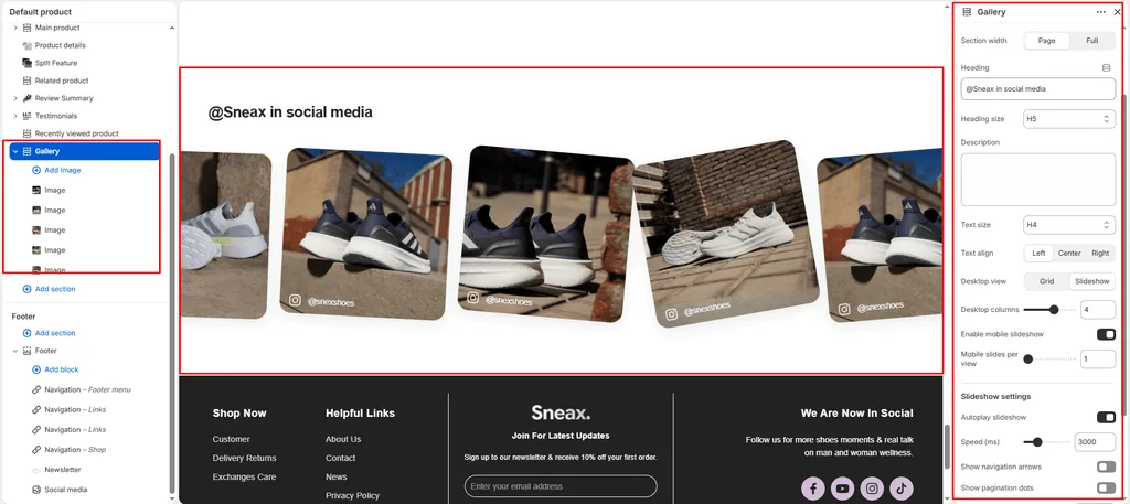
| Desktop view | Select | slideshow | grid, slideshow | Select slideshow for a smooth Swiper carousel with progress bar navigation, or grid for an expansive multi-column showcase. |
| Desktop columns | Range | 5 | 1 to 6 (step: 1) | Determines how many square gallery cards appear per row on desktop screens (5 columns is ideal for a clean Instagram feed feel). |
| Enable mobile slideshow for grid | Checkbox | true | Checked / Unchecked | When desktop view is set to grid, checking this automatically converts mobile devices into a swipeable carousel to prevent endless vertical page scrolling. |
| Mobile slides per view | Range | 1 | 1 to 3 (step: 1) | Controls how many cards are visible simultaneously on mobile phone screens (1 to 2 slides is recommended). |
3. Slideshow Automation & Navigation Controls
Customize carousel navigation and autoplay timers when slideshow mode is active:
| Setting | Type | Default | Options / Range | Description |
|---|---|---|---|---|
| Autoplay slideshow | Checkbox | false | Checked / Unchecked | Toggles automated slide transitions without requiring manual user swiping. |
| Slideshow speed | Range | 3000ms | 1000ms to 9000ms (step: 100ms) | Adjusts the slide transition delay (3000ms = 3 seconds per slide). |
| Show navigation arrows | Checkbox | true | Checked / Unchecked | Displays rounded pill previous and next arrow buttons. |
| Show pagination | Checkbox | true | Checked / Unchecked | Displays a horizontal progress bar indicator showing current slide progression. |
4. Gallery Image Block Settings
Each photo in the gallery is added as an Image block:
| Setting | Type | Default | Options / Range | Description |
|---|---|---|---|---|
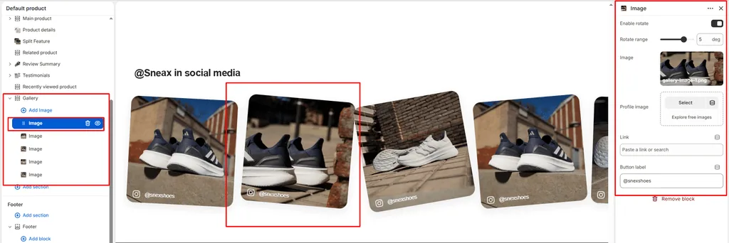
| Enable rotate | Checkbox | false | Checked / Unchecked | Enables a fixed rotation tilt on this specific card for a scattered polaroid look. |
| Rotate range | Range | 0deg | -10deg to 10deg (step: 1deg) | Sets the initial static rotation angle in degrees (e.g., -3deg or 4deg). |
| Image | Image Picker | Blank | Image upload | High-resolution square (1:1) photo of sneaker on-foot styling, store events, or unboxing shots (up to 1200px wide). |
| Account image | Image Picker | Blank | Image upload | Small circular avatar or profile picture (24x24px) displayed on the overlay button. |
| Link | URL | Blank | Web / Social URL | External URL to your Instagram profile/post (e.g., https://instagram.com/yourstore) or internal product link. |
| Link label | Text | FOLLOW NOW | Text string | Actionable button copy overlaid across the bottom of the card (e.g., “@attar_official”, “Shop This Fit”). |
5. Spacing & Mobile Optimization
Fine-tune vertical breathing room across desktop and handheld devices:
| Setting | Type | Default | Options / Range | Description |
|---|---|---|---|---|
| Top padding | Range | 100px | 0px to 200px (step: 5px) | Vertical padding above the gallery section on desktop monitors. |
| Bottom padding | Range | 100px | 0px to 100px (step: 1px) | Vertical padding below the gallery section on desktop monitors. |
Responsive Behavior: On screens narrower than 767px, top and bottom padding are automatically reduced by 50% to maintain compact screen usage. On mobile, gap between grid cards reduces from 24px to 16px, and mobile slideshow mechanics ensure smooth finger-swipe browsing.
Interactive 3D Tilt Mechanics
The Gallery section includes built-in mouse-tracking physics (initTiltAnimation):
- Dynamic 3D Tilting: When a user hovers over an image card on desktop, the theme calculates the cursor’s exact coordinates relative to the card bounds.
- Smooth Reset: Moving the cursor off the card triggers a smooth cubic-bezier transition that returns the image to its resting position.
Sneaker Store Best Practices
- Tag Real Instagram Influencers & Handles: When featuring customer UGC or influencer on-foot photos, upload the creator’s avatar in the Account image setting and enter their handle into the Link label (e.g.,
@sneaker_attar). Authenticating real community members builds immense trust with potential buyers. - Scatter Cards with Subtle Polaroid Rotation: Turn on Enable rotate across alternating cards and set subtle tilt angles (e.g., Card 1:
-2deg, Card 2:3deg, Card 3:-1deg, Card 4:2deg). This creates a stylish, scattered moodboard feel that mimics streetwear lookbook collages. - Keep Mobile Slideshow Enabled: With 5 to 8 images in your gallery, a vertical mobile stack pushes vital footer and conversion links down the page. Always keep Enable mobile slideshow for grid checked to let customers swipe horizontally through your social lookbook.
Was this article helpful?
Thanks for the feedback.
Still need help?
Can't find what you're looking for? Send us a message and we'll help you out.