

Colors
On this page
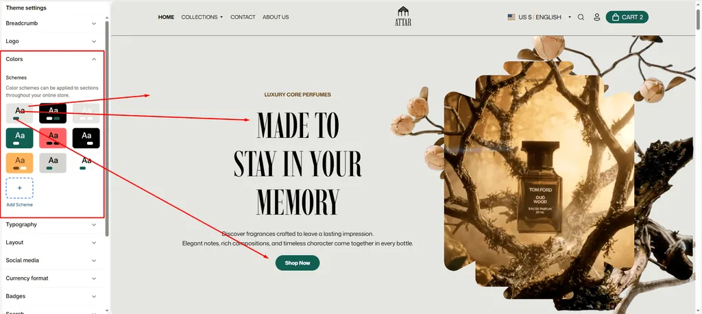
Color schemes allow you to establish consistent, cohesive palettes across your entire perfume and fragrance store. Attar leverages Shopify’s Color Schemes engine, letting you apply distinct styles to individual sections with a single click.
Whether you want a rich, dark mood for an exclusive oud launch or a clean, soft aesthetic for delicate floral scents, color schemes ensure effortless brand consistency.
How to Access Color Settings
- From your Shopify Admin, navigate to Online Store > Themes.
- Click Customize on the Attar theme.
- Click the Theme settings (⚙️ gear icon) in the left sidebar.
- Select the Colors tab to view, edit, or add color schemes.
Understanding Color Schemes in Attar
Instead of manually picking background and button colors for every individual section, Attar uses global Color Schemes (e.g., Scheme 1, Scheme 2, Scheme 3).
- Global Consistency: Change a color scheme once, and all sections using that scheme update automatically.
- Section-Level Control: Any section with a Color scheme dropdown can use any palette you create.
- Pre-configured Palettes: Attar comes pre-loaded with curated color schemes designed for luxury fragrance stores.
Color Scheme Options Breakdown
Each color scheme in Attar includes controls for backgrounds, text, and interactive buttons:
| Color Option | Setting Key | Description |
|---|---|---|
| Background | background | Sets the solid base background color for the section. |
| Background gradient | background_gradient | Optional gradient overlay. Overrides the solid background when set. |
| Text | text | Sets the primary body text, descriptions, and headings color. |
| Highlight text | highlight_text | Accent color used to emphasize specific words in headings or announcements. |
| Primary button | primary_button | Background color of primary call-to-action buttons (e.g., “Add to Cart”, “Shop Now”). |
| Primary button label | primary_button_label | Text color on primary buttons. |
| Secondary button | secondary_button | Background color for secondary buttons (e.g., “Explore More”, “View Details”). |
| Secondary button label | secondary_button_label | Text color on secondary buttons. |
| Link button | link_button | Color styling for inline hyperlinks and standalone text links. |
| Link button label | link_button_label | Text color for link-style buttons with arrows. |
| Button icon | button_icon | Foreground color for arrow icons displayed inside buttons. |
How to Apply a Color Scheme to a Section
- In the Shopify Theme Editor preview, select the section you want to customize (e.g., Featured Collection, Hero Section, or Slideshow).
- Look for the Color scheme dropdown in the section settings on the right panel.
- Select your desired scheme (e.g., Scheme 1 for light sections, or Scheme 2 for a rich dark aesthetic).
- Attar immediately updates the background, text, and buttons for that section.
Pro Tips for Attar Stores
- High-Contrast Dark Sections: Use a dark color scheme for limited perfume batch announcements or countdown banners to make them stand out.
- Readable Product Details: Make sure your body text and button colors have strong contrast against their backgrounds so fragrance notes, sizes, and prices are easy to read.
- Highlight Key Words: Use the Highlight text color to spotlight special keywords in headings (such as “Artisanal”, “Pure Scent”, or “Bestseller”).
Was this article helpful?
Thanks for the feedback.
Still need help?
Can't find what you're looking for? Send us a message and we'll help you out.