

Group
On this page
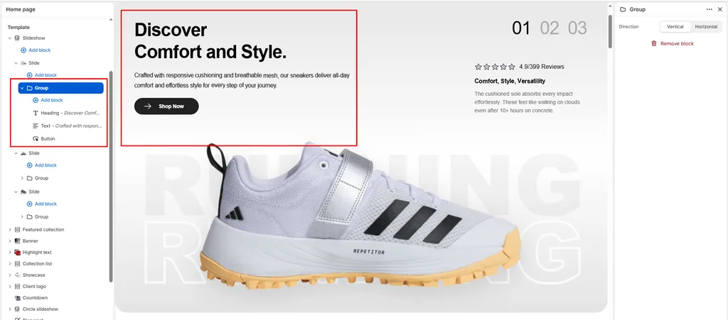
The Group block is a foundational layout container in Attar that leverages Shopify’s modern Nested Block Architecture ({% content_for 'blocks' %}). It allows sneaker boutiques and footwear brands to bundle multiple independent child blocks (such as a Title, Subtitle, Text, Countdown, and dual Buttons) into a single cohesive layout unit.
Using Group blocks keeps your editorial design organized. Rather than having loose elements scattered within a section, bundling related blocks inside a Group ensures they move together as a single component when reordered in the Shopify Theme Editor.
1. How Nested Groups Work
When you add a Group block to a compatible section (such as Banner, Slideshow, Video, Custom Section, or inside a Column), it acts as a flexible, empty structural wrapper:
- Add Child Blocks: Click (+) Add block indented directly beneath the Group block in the left-hand sidebar to insert any Universal Theme Block (
@theme) or App Block (@app). - Drag & Drop Reordering: Reorder child blocks within the group using the six-dot handle (
⋮⋮), or move the entire Group up and down within the parent section as one unified block. - Consistent Layout Bounds: Child blocks inside the group maintain uniform spacing and adapt automatically to desktop and mobile screen widths.
2. Block Settings
Click on the Group block in the Theme Editor sidebar to customize its structural flow:
| Setting | Type | Default | Options | Description |
|---|---|---|---|---|
| Direction | Select | Vertical | Vertical, Horizontal | Controls the flex layout and orientation of child blocks nested inside this group. |
3. Direction Settings Explained
Vertical (direction: vertical)
- Stacks all nested child blocks neatly on top of each other.
- Built-in Flexbox styling (
display: flex; flex-direction: column; gap: 10px;) applies an exact 10px vertical gap between elements. - Best For: Creating clean typographic lockups (e.g., Subtitle $\rightarrow$ Headline $\rightarrow$ Sneaker Material Description).
Horizontal (direction: horizontal)
- Places nested child blocks side-by-side in a responsive row.
- Built-in Flexbox styling (
display: flex; flex-direction: row; flex-wrap: wrap; align-items: center; justify-content: space-between;) automatically aligns items horizontally and allows them to wrap gracefully on smaller screens. - Attar automatically applies
width: fit-content;to nested buttons so they don’t stretch artificially across the screen. - Best For:
- Placing Dual Call-to-Action Buttons side-by-side (e.g., “Shop Men’s” next to “Shop Women’s”).
- Placing a small trust badge Image right next to a Button.
- Aligning a Countdown Timer alongside a “Drop Alert” Heading.
4. Supported Child Blocks Inside a Group
Because the Group block declares "blocks": [{ "type": "@theme" }, { "type": "@app" }], you can nest any of the following elements:
- Title (
title): Cascade-animated drop headlines. - Subtitle (
subtitle): Kicker tags (e.g., “Limited to 300 Pairs”). - Text (
text): Paragraph copy with opacity adjustments. - Rich Text (
richtext): Formatted text with bulleted feature lists. - Button / Link (
link): Primary, secondary, or link-style CTAs with animated SVG icons. - Countdown (
countdown): Live ticking drop timer. - Image (
image): Detail macro shots, certification logos, or trust seals. - App Blocks (
@app): Third-party review stars, size chart triggers, or stock badge widgets.
Step-by-Step: Creating Side-by-Side Dual Buttons
A common requirement for sneaker brands is placing two buttons side-by-side in a hero section. Here is how to configure it in Attar:
- In your Banner or Slideshow section, click (+) Add block and select Group.
- Click on the newly created Group block and set Direction to Horizontal.
- Under the Group block, click (+) Add block and select Button (secondary):
- Label:
Shop Men's Kicks - Style:
Primary button - Icon:
arrow
- Label:
- Under the same Group block, click (+) Add block and add a second Button (secondary):
- Label:
Shop Women's Kicks - Style:
Secondary button - Icon:
arrow
- Label:
- Both buttons will now sit side-by-side with clean spacing on desktop displays and stack neatly if screen width constricts on mobile!
Sneaker Store Best Practices
- Drop Launch Lockup:
- Create a vertical Group containing a Subtitle (“Vault Restock”), a Title (“AIR JORDAN 4 RETRO”), and a Countdown block set to your drop date. This ensures the headline and timer stay visually connected as a single announcement pod.
- Dual-Category Navigation in Hero Banners:
- Use a horizontal Group containing two buttons to segment high-volume traffic immediately: one leading to high-top retros and the other to low-top lifestyle sneakers.
- Combine Badges with Action Buttons:
- In a horizontal Group, insert a small verified authentic Image badge alongside an “Order Now” Button to give buyers final reassurance on checkout-intent banners.
Was this article helpful?
Thanks for the feedback.
Still need help?
Can't find what you're looking for? Send us a message and we'll help you out.