

Header
On this page
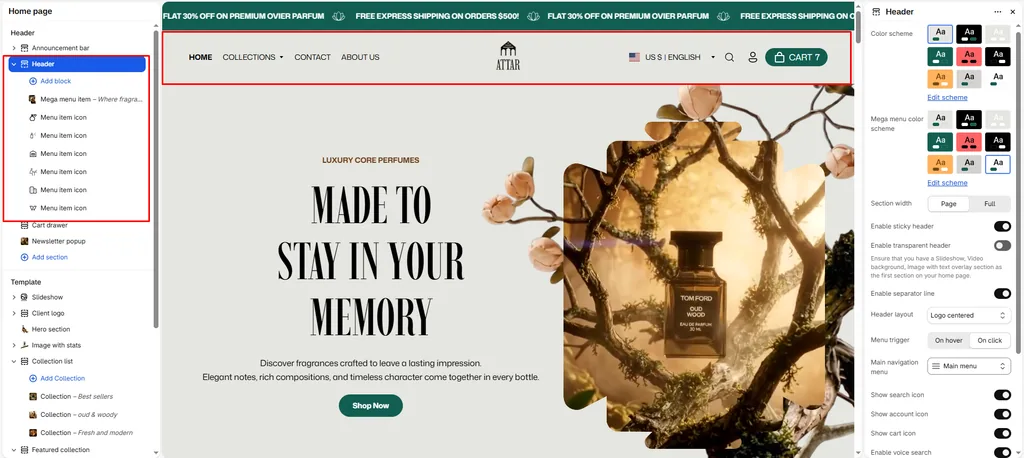
The Header is the main navigation center of your storefront. In Attar, the header is designed to deliver a luxury browsing experience for perfume and fragrance shoppers, featuring flexible logo layouts, floating transparent modes, voice search, and visual Mega Menus.
How to Access Header Settings
- From your Shopify Admin, navigate to Online Store > Themes.
- Click Customize on the Attar theme.
- In the left sidebar under the Header group, click Header.
- Configure your layout and menu preferences, or click Add Mega menu item to create visual dropdown menus.
- Click Save.
Header Layout & Style Settings
| Setting Name | Type | Options / Range | Default | Description |
|---|---|---|---|---|
| Color scheme | Color Scheme Picker | Any configured color scheme | Scheme 1 | Sets the background and text color scheme for the main navigation bar. |
| Drawer color scheme | Color Scheme Picker | Any configured color scheme | Scheme 1 | Sets a separate color scheme specifically for the slide-out mobile menu and drawer. |
| Section width | Dropdown | Page width, Full width | Page width | Controls whether header navigation stays within the page container or spans edge-to-edge. |
| Sticky header | Checkbox | Enabled / Disabled | Enabled | When enabled, the header smoothly remains locked to the top as customers scroll down. |
| Transparent header | Checkbox | Enabled / Disabled | Enabled | Creates a transparent floating header overlay over your homepage Hero Section or Slideshow. |
| Show line separator | Checkbox | Enabled / Disabled | Enabled | Displays a subtle divider line beneath the header bar. |
| Header style | Dropdown | Logo centered, Logo left, Logo top, Drawer | Logo centered | Sets the placement of your brand logo and navigation menu. |
| Top padding | Slider / Range | 0px – 200px (Step: 5px) | 0px | Fine-tunes spacing above the header. |
| Bottom padding | Slider / Range | 0px – 100px (Step: 1px) | 0px | Fine-tunes spacing below the header. |
Header Styles Explained
- Logo Centered (Default): Places your perfume brand logo in the center of the bar, with navigation links and action icons balanced on both sides.
- Logo Left: Traditional e-commerce layout with your logo on the left, navigation in the middle, and utility icons on the right.
- Logo Top: A stacked two-tier layout featuring a centered logo and tools on the top row, with a dedicated second row below exclusively for menu links.
- Drawer (Minimalist): Keeps the top bar ultra-clean by tucking all navigation links inside an animated hamburger menu drawer on all screen sizes.
Navigation & Utility Controls
| Setting Name | Type | Default | Description |
|---|---|---|---|
| Main menu | Menu Picker | main-menu | Selects your primary Shopify navigation menu list. |
| Menu trigger | Dropdown (Hover, Click) | Hover | Determines whether dropdown menus open on mouse hover or on click. |
| Show search icon | Checkbox | Enabled | Toggles the search icon in the header. |
| Show account icon | Checkbox | Enabled | Toggles the customer profile/login icon. |
| Show cart icon | Checkbox | Enabled | Toggles the shopping cart trigger icon. |
| Enable voice search | Checkbox | Enabled | Enables speech-to-text voice recognition inside the search bar. |
| Enable country/region selector | Checkbox | Enabled | Displays the international currency and language selector. |
Creating Visual Mega Menus
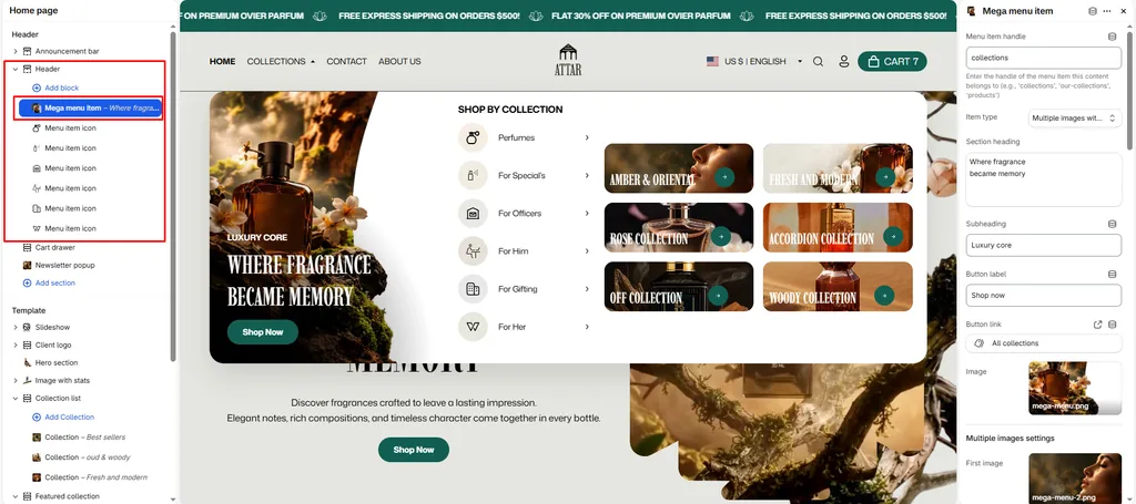
To turn a standard menu link into an expansive visual mega menu, click Add block under Header and select Mega menu item.
1. Connect to Parent Link
- Parent Mega Menu: Enter the exact title of the navigation link in your Main Menu where this dropdown should attach (e.g., Fragrances, Oud & Amber, Collections, or Best Sellers).
2. Select Item Type
Attar supports 6 specialized mega menu layouts:
- Collection Tabs: Displays up to 6 interactive tabs (e.g., Pure Attars, Eau de Parfum, Discovery Sets, Home Fragrance). Hovering over each tab updates sub-links and shows a promotional perfume image with custom text.
- Image: Showcase promotional banner cards with headlines, subheadings, and direct buttons (e.g., highlighting a new scent launch).
- Products: Display live perfume cards with bottle images, titles, and prices directly inside the dropdown menu (up to 8 products).
- Collections: Highlight up to 4 featured fragrance collections with their cover imagery.
- Blogs: Feature recent articles from your perfume journal or fragrance guide.
- Page: Link key informational pages (such as Scent Guide, About the House, or Shipping Policies).
3. Menu Icons Block
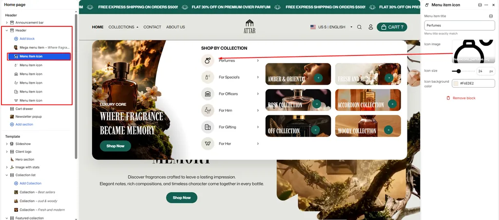
You can also add a Menu Icon block to display custom mini icons next to specific navigation links to make key collections visually stand out.
Pro Tips for Attar Stores
- Organize by Scent Family: Use the Collection Tabs layout to group your perfumes by olfactory families (Woody, Floral, Oriental, Fresh). Shoppers can explore your entire catalog from a single menu.
- Spotlight New Releases: Use the Image mega menu option to feature high-resolution bottle photography and an “Explore Collection” button right inside the main menu.
Was this article helpful?
Thanks for the feedback.
Still need help?
Can't find what you're looking for? Send us a message and we'll help you out.