

Collection List
On this page
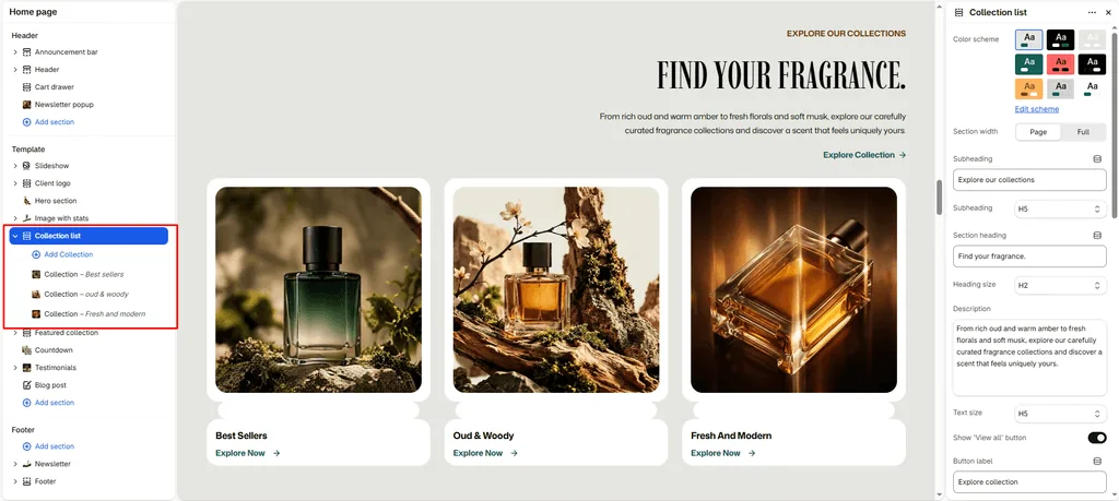
The Collection List section allows you to feature a curated showcase of your top fragrance categories anywhere across your store (such as the Homepage, About page, or bespoke landing pages).
It serves as a primary visual discovery gateway, guiding scent lovers directly to your most popular fragrance families (such as Oud & Woody, Amber & Warm Resins, Pure Attars, Floral Bouquets, and Discovery Sets).
Attar supports both a structured Static Grid and a Touch-Enabled Carousel with autoplay, live fragrance count badges, and GSAP scroll-shift animations.
How to Access Collection List Settings
- From your Shopify Admin, navigate to Online Store > Themes.
- Click Customize on the Attar theme.
- Open the page template where you want to add the section (e.g., Home page).
- In the left sidebar, click Add section and choose Collection list.
- Configure your layout, slideshow options, and add your collection blocks.
- Click Save.
Layout & Heading Settings
| Setting Name | Type | Options / Range | Default | Description |
|---|---|---|---|---|
| Color scheme | Color Scheme Picker | Any configured color scheme | Scheme 1 | Sets the background and typography color palette for the entire section. |
| Section width | Dropdown | Page width, Full width | Page width | Determines whether the section stays within the page container or spans edge-to-edge. |
| Subheading | Text | e.g., “Curated Olfactory Categories” | Subheading | Small uppercase label above the main section title. |
| Subheading size | Dropdown | H1 – H6 | H5 | Sets the typography size hierarchy for the subheading. |
| Section heading | Text | e.g., “Explore Scent Families” | None | Main title displayed above the collection cards. |
| Heading size | Dropdown | H1 – H6 | H4 | Sets the typography size hierarchy for the section heading. |
| Description | Textarea | Formatted text | None | Optional description paragraph positioned beneath the headline. |
| Text size | Dropdown | H1 – H6 | H3 | Sets the font size of the description text. |
| Text align | Dropdown | Left, Center, Right | Left | Sets horizontal alignment for the section headings and description. |
| Show product count | Checkbox | Enabled / Disabled | Enabled | Displays a real-time badge on each card showing total available fragrances (e.g., “16 Scents”). |
| Show view all | Checkbox | Enabled / Disabled | Enabled | Displays a call-to-action button linking to your full collections catalog. |
| Button label | Text | e.g., “View All Categories” | Button label | Text displayed on the call-to-action button. |
| Button style | Dropdown | Button primary, Button secondary, Button link | Button primary | Chooses the visual style of the button. |
| Top padding | Slider / Range | 0px – 200px (Step: 5px) | 100px | Vertical whitespace above the collection cards. |
| Bottom padding | Slider / Range | 0px – 100px (Step: 1px) | 100px | Vertical whitespace below the collection cards. |
Grid & Slideshow Display Controls
| Setting Name | Type | Options / Range | Default | Description |
|---|---|---|---|---|
| Desktop view | Dropdown | Grid, Slideshow | Slideshow | Choose between a multi-column static grid or a smooth horizontal carousel on desktop. |
| Desktop columns | Slider / Range | 1 – 6 (Step: 1) | 5 | Number of collection cards visible per row or slide view on desktop. |
| Mobile slideshow | Checkbox | Enabled / Disabled | Enabled | Converts the mobile view into a touch-friendly swipeable carousel to save vertical screen space. |
| Mobile slides | Slider / Range | 1 – 3 (Step: 1) | 1 | Number of collection cards visible simultaneously on smartphone screens. |
Slideshow Behavior Settings
| Setting Name | Type | Options / Range | Default | Description |
|---|---|---|---|---|
| Autoplay slideshow | Checkbox | Enabled / Disabled | Disabled | Automatically rotates the collection carousel continuously. |
| Slideshow speed | Slider / Range | 10 – 100 (Step: 1) | 30 | Controls rotation pacing when autoplay is active. |
| Show navigation | Checkbox | Enabled / Disabled | Disabled | Displays previous and next arrow buttons. |
| Show pagination | Checkbox | Enabled / Disabled | Disabled | Displays clickable pagination indicator dots at the bottom of the slider. |
Stagger & Scroll Shift Animations
| Setting Name | Type | Default | Description |
|---|---|---|---|
| Enable stagger | Checkbox | Enabled | Creates an editorial, asymmetric height offset between columns for a high-fashion lookbook aesthetic. |
| Enable scroll shift | Checkbox | Enabled | Activates a smooth parallax vertical shift on collection cards as the user scrolls down the page. |
Adding Collection Blocks
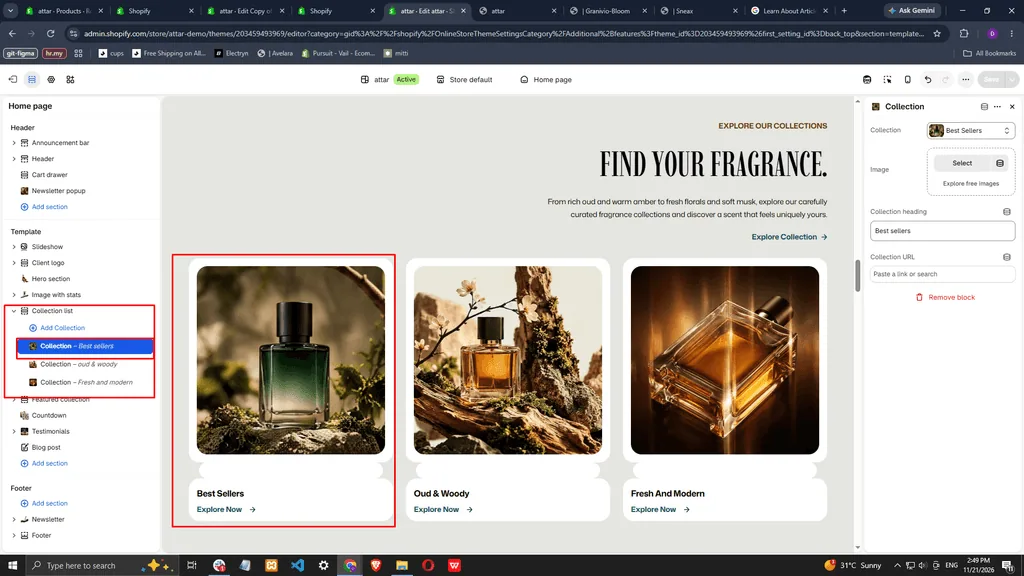
To showcase specific fragrance categories, add individual Collection blocks inside the section:
- Click Add Collection under the section in the Theme Editor sidebar.
- Select your target Shopify collection from the Collection picker (e.g., Pure Oud Oils).
- Optional Custom Overrides:
- Image: Upload a custom high-impact perfume campaign photo to override the collection’s default Shopify cover photo.
- Heading: Enter a custom title (e.g., override “Woody” with “Rare Woods & Amber”).
- Link: Provide a custom destination URL if you want the card to route to a specific promotional landing page instead of the default collection link.
Pro Tips for Attar Stores
- Fast Category Discovery: Setting Desktop view to
Slideshowwith Desktop columns set to5allows shoppers to preview your main fragrance families without pushing down the rest of your homepage content. - Mobile Thumb Optimization: Keep Mobile slides set to
1with Mobile slideshow enabled. This allows mobile shoppers to glide through scent categories naturally using their thumb.
Was this article helpful?
Thanks for the feedback.
Still need help?
Can't find what you're looking for? Send us a message and we'll help you out.