

Buttons
On this page
- Accessing the Button Block Settings
- Block Settings
- Detailed Setting Explanations
- 1. Button Styles (style_class)
- 2. Animated Button Icons (button_icon)
- 3. Kinetic Button Hover Animation (enable_animation)
- 4. Text Alignment (text_align)
- How to Create Side-by-Side Dual Buttons
- Sneaker Store Best Practices
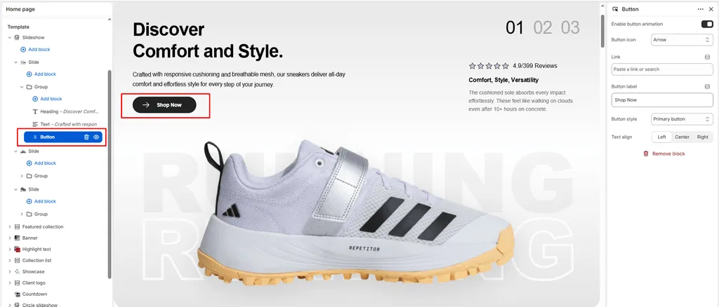
The Button block (identified internally as Link in the block catalog) is the primary Call-to-Action (CTA) element in Attar. Whether directing collectors to a high-heat sneaker drop, launching an upcoming raffle page, exploring seasonal lookbooks, or linking to a sizing chart, this block drives conversion with high visual impact.
Every Button block in Attar comes equipped with interactive kinetic hover animations and built-in vector SVG icons that animate on interaction.
Accessing the Button Block Settings
- In the Shopify Theme Editor, navigate to any page template containing a compatible section (e.g., Banner, Slideshow, Video, or Custom Section).
- In the left-hand sidebar, locate the parent section or container.
- Click (+) Add block and select Button (secondary) or Link (or click an existing Button block).
- Customize the settings in the right-hand panel.
Block Settings
| Setting | Type | Default | Options / Range | Description |
|---|---|---|---|---|
| Button label | Text | Button label | Free Text | The text displayed inside the button (e.g., “Shop Retro Drops”). |
| Link | URL | Blank | Store URL / External | The destination URL where the customer is redirected upon clicking. |
| Button style | Select | Primary button | Primary button, Secondary button, Link button | Controls the visual hierarchy and styling of the button. |
| Enable animation | Checkbox | Enabled | Toggle | Activates Attar’s signature kinetic hover micro-animations. |
| Button icon | Select | cart | 9 Vector Icons | Selects an animated icon to pair with the button label. |
| Text align | Select | Left | Left, Center, Right | Controls horizontal alignment within the container. |
Detailed Setting Explanations
1. Button Styles (style_class)
Attar provides three distinct styling presets that inherit their color schemes directly from your active section’s color palette:
- Primary button (
button-primary)(Default):- Solid high-contrast background fill with contrasting label text.
- Recommended for your primary conversion goals: “Shop Now”, “Buy Drop”, or “Add to Cart”.
- Secondary button (
button-secondary):- Sleek, elegant outline/border treatment with a translucent or muted background.
- Ideal for secondary options: “View Lookbook”, “Size Guide”, or “Read Story”.
- Link button (
button-link):- Minimalist underline text link.
- Great for subtle prompts: “Learn More”, “Terms & Conditions”, or “View All Archive”.
2. Animated Button Icons (button_icon)
Every button can be paired with an SVG icon that animates dynamically when hovered or clicked:
| Icon Option | Visual Element | Best Use in Footwear Stores |
|---|---|---|
| cart (Default) | Shopping cart with rolling wheels & checkmark | Direct purchase CTAs (“Shop Now”, “Grab Your Pair”). |
| arrow | Directional right chevron / arrow line | Category discovery (“Explore Drop”, “View All Sneakers”). |
| quickview | Eye silhouette with animated pupil | Previewing releases or lookbook styles. |
| heart | Wishlist heart silhouette | Saving upcoming drops or favorite silhouettes. |
| search | Magnifying glass with search handle | Searching the footwear vault or catalog. |
| location | Map pin with animated pin-dot | Store locators, pop-up events, and retail boutiques. |
| phone | Telephone receiver with signal rings | VIP concierge, customer support, or orders desk. |
| Envelope with unfolding flap | Newsletter subscriptions or raffle entries. | |
| account | User profile avatar | Member portals, loyalty clubs, and order history. |
3. Kinetic Button Hover Animation (enable_animation)
When enabled, Attar adds the .button-anim class, activating custom CSS animations (assets/button-anim.css):
- Smooth background color transitions and scaling on hover.
- SVG icons perform unique micro-interactions (e.g., cart wheels rotate, arrow lines advance, email envelopes flap).
- When a button is disabled (e.g., sold-out releases), it gracefully dims to 60% opacity with an unclickable cursor.
4. Text Alignment (text_align)
- Left (Default): Traditional editorial layout. Keep consistent with left-aligned headings and descriptions.
- Center: Standard for centered hero banners, countdown blocks, and 404/password templates.
- Right: Asymmetric, high-fashion streetwear lookbook alignment.
How to Create Side-by-Side Dual Buttons
To offer shoppers dual choices (such as “Shop Men’s” alongside “Shop Women’s”):
- In the parent section, click (+) Add block and select Group.
- Click on the Group block and set Direction to Horizontal.
- Inside the Group block, add your First Button:
- Label:
Shop Men's - Style:
Primary button - Icon:
arrow
- Label:
- Add your Second Button inside the same Group block:
- Label:
Shop Women's - Style:
Secondary button - Icon:
arrow
- Label:
- Both buttons will now sit side-by-side in desktop view and gracefully wrap on mobile screens!
Sneaker Store Best Practices
- Pair Primary & Secondary Styles:
- When offering dual options, make the main action Primary button (solid) and the secondary action Secondary button (outline). This prevents visual competition and guides the shopper’s eye.
- Use the Arrow Icon for Catalog Browsing:
- Setting the icon to
arrowprovides an intuitive directional cue that increases click-through rates on collection and banner links.
- Setting the icon to
- Match Button Alignment to Section Typography:
- If your Heading and Text blocks are centered, ensure your Button block is also set to
Centerto maintain clean visual symmetry.
- If your Heading and Text blocks are centered, ensure your Button block is also set to
Was this article helpful?
Thanks for the feedback.
Still need help?
Can't find what you're looking for? Send us a message and we'll help you out.