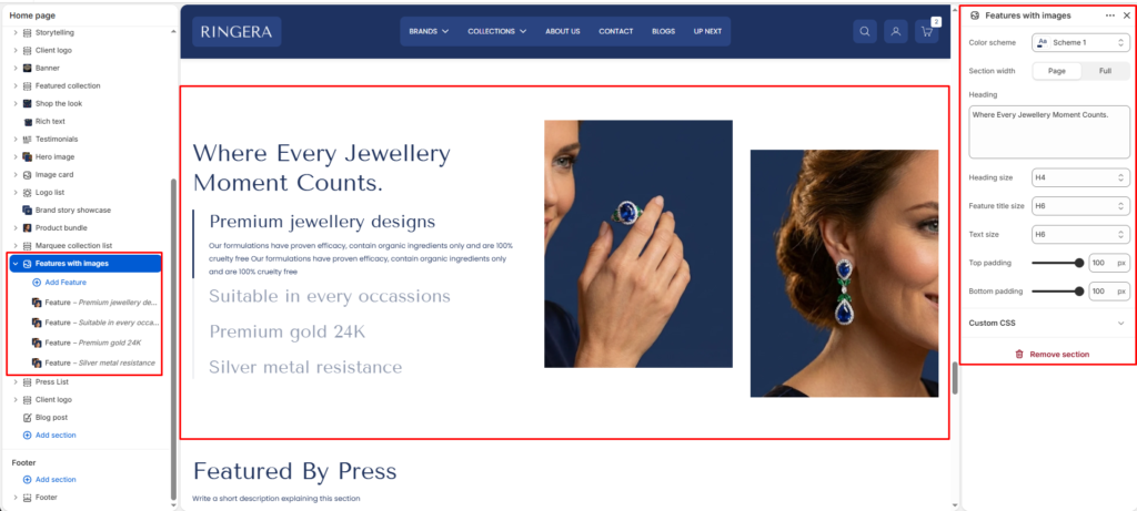
The Features with Images section presents a large section heading alongside a vertically stacked list of expandable feature items — each with its own title, description text, and two supporting images. Only the active (selected) feature expands to show its full description and images; the remaining features display as collapsed titles. This creates an interactive accordion-style layout that keeps the page clean while showcasing multiple product or brand features.
Color scheme #
Choose the desired color palette for this section from the available theme schemes.
Section width #
Choose how wide the section spans on the page:
- Page: Aligns section content with the page container.
- Full: Stretches the section edge-to-edge across the browser window.
Heading #
The large primary heading displayed at the top of the left column, above the feature list. This sets the overall context or theme for all the features listed below. Leave blank to remove the heading from the layout.
Heading size #
Sets the typographic scale of the section heading. Defaults to H4 for a strong, prominent headline that anchors the section without dominating the page hierarchy.
Feature title size #
Sets the typographic size used for each individual feature’s title in the accordion list — both when expanded (active) and when collapsed. Defaults to H6. The active feature title is visually emphasized with full opacity while collapsed titles are rendered in a muted style.
Text size #
Sets the typographic size of each feature’s description body text — visible only when a feature is in its expanded (active) state. Defaults to H6 for a compact, readable paragraph beneath the feature title.
Top padding #
Controls the vertical spacing above the section. Increase to add breathing room between this section and the one above it on the page.
Bottom padding #
Controls the vertical spacing below the section. Increase to add breathing room between this section and the one below it on the page.
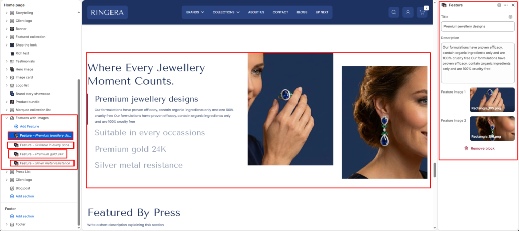
Feature Block #
Each Feature block adds one accordion row to the features list. When a customer clicks on a feature, its title stays visible at full opacity and its description and two images are revealed. Clicking another feature collapses the current one and expands the new selection. Each block has the following settings:
Title #
The feature name displayed as the clickable accordion row label. This text is always visible — both when the feature is expanded and when it is collapsed. Collapsed features appear in a muted, lower-opacity style; the active feature title is rendered at full opacity.
Description #
The body text revealed when this feature is in its active (expanded) state. Use this to describe the specific quality, benefit, or detail associated with the feature title. Only visible for the currently active feature.
Feature image 1
The primary image displayed in the right column when this feature is active. Shown as the larger or first of the two image slots. Use a high-quality product or lifestyle photo that visually represents this specific feature.
Feature image 2 #
A secondary supporting image displayed alongside Feature image 1 in the right column when this feature is active. Provides an additional visual angle or context for the feature — for example, a close-up detail or alternate product view. Both images update simultaneously when a different feature is selected.