- Color scheme
- Section width
- Subheading
- Subheading size
- Heading
- Heading size
- Text
- Text size
- Text align
- Desktop view
- Desktop columns
- Enable mobile slideshow
- Mobile slides per view
- Show navigation arrows
- Show pagination dots
- Autoplay slideshow
- Speed
- Top padding
- Bottom padding
- Logo block — image
- Logo block — heading
- Logo block — text
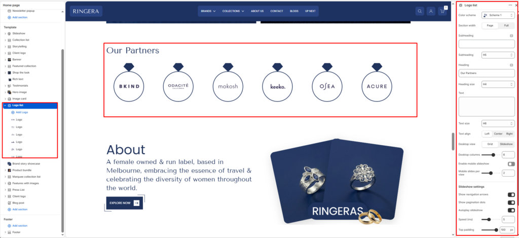
The Logo list section shows a row of partner or brand marks with optional titles and short captions. You can present them as a grid or as a slideshow, and you can keep desktop in grid while using a carousel on smaller screens.
Color scheme #
Applies one of your theme color presets to the section background and typography.
Section width #
Chooses whether the section stays within page width or spans full width edge to edge.
Subheading #
Optional line above the main title, for example a category label.
Subheading size #
Sets the subheading scale using theme-defined options from h1 through h6.
Heading #
The main section title, such as “Our partners”.
Heading size #
Sets the heading scale using theme-defined options from h1 through h6.
Text #
Optional supporting copy under the heading.
Text size #
Sets the supporting text scale using theme-defined options from h1 through h6.
Text align #
Aligns the heading area to the left, center, or right.
Desktop view #
Switches desktop behavior between a grid of logos and a slideshow that visitors swipe or advance with controls.
Desktop columns #
When using grid on desktop, sets how many logos appear per row. The range is 2 to 8.
Enable mobile slideshow #
Turns the logo row into a slideshow on mobile while desktop can remain a grid.
Mobile slides per view #
Sets how many logos are visible at once on mobile in slideshow mode. The range is 1 to 3.
Show navigation arrows #
Shows or hides previous and next controls when the section runs as a slideshow.
Show pagination dots #
Shows or hides the slideshow progress indicator.
Autoplay slideshow #
When slideshow mode is active, turns automatic advancing of slides on or off.
Speed #
Controls autoplay pacing on a scale from 2 to 10 (the theme uses this to set the delay between slides).
Top padding #
Adds space above the section from 0px to 100px.
Bottom padding #
Adds space below the section from 0px to 100px.
Logo block — image #
The logo or brand image for that item. If empty, a placeholder appears.
Logo block — heading #
Optional label shown with the logo, such as the brand name.
Logo block — text #
Optional short description or tagline under the heading for that logo.