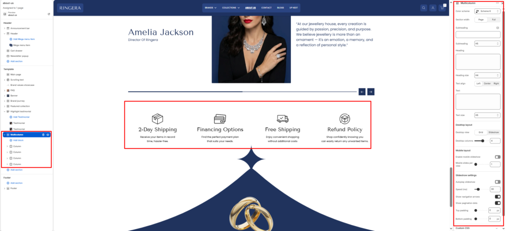
The Multicolumn section is designed to display a series of content blocks (columns) side-by-side.
It’s ideal for showcasing features, values, benefits, or services — for example, highlighting brand qualities, product advantages, or key information in a visually organized layout.
Each column supports an image, title, text, and optional link, giving merchants flexible control over how content is presented.
Section Settings #
Color scheme #
Applies one of your theme color presets to the section background and typography.
Section width #
Chooses whether the section stays within page width or spans full width edge to edge.
Subheading #
Optional line above the main title, for example a category label.
Subheading size #
Sets the subheading scale using theme-defined options from h1 through h6.
Heading #
The main section title, such as “Our partners”.
Heading size #
Sets the heading scale using theme-defined options from h1 through h6.
Text #
Optional supporting copy under the heading.
Text size #
Sets the supporting text scale using theme-defined options from h1 through h6.
Text align #
Aligns the heading area to the left, center, or right.
Columns per row (desktop) #
Define how many columns appear side-by-side on desktop screens.
Common options: 2-4 columns per row.
Stack columns on mobile #
Enable this option to stack columns vertically on smaller devices for better readability and spacing.
Top padding / Bottom padding #
Control vertical spacing above and below the section. Useful for maintaining consistent layout flow.
Blocks (Columns) #
Each Column block represents one content card inside the multicolumn layout.
Multiple columns can be added to form rows of equal-height, balanced items.
Block Column #
Each column block contains the following options:
Image #
Upload an image to represent the column visually.
Ideal for product shots, icons, or feature illustrations.
Heading #
The title or label for the column content.
Text #
Add a short description or supporting information beneath the heading.
Link (optional) #
Add a button or make the image clickable by linking to another page, product, or collection.