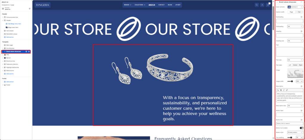
The Brand Values Showcase section presents a full-width, image-and-text composition designed to communicate your brand story, values, or a key message. It combines a featured product or lifestyle image on one side with a structured text block — including a subheading, heading, body description, and a call-to-action button — on the other. All text elements have independently configurable sizes and alignment.
Color scheme #
Choose the desired color palette for this section from the available theme schemes.
Section width #
Choose how wide the section spans on the page:
- Page: Aligns section content with the page container.
- Full: Stretches the section edge-to-edge across the browser window.
Subheading #
Enter a small introductory text displayed above the heading.
Subheading size #
Choose the size of the subheading text H1 To H6.
Heading #
Enter the main heading for the section.
Heading size #
Select the size of the heading text H1 To H6.
Text #
Add descriptive content to tell your brand story.
Text size #
Choose the size of the text content H1 To H6.
Text alignment #
Select the alignment of the content.
- Left
- Center
- Right
Image #
Upload the featured image displayed in the visual column of the section. This is typically a lifestyle, product, or brand photography image that complements the text content. Recommended: use a high-resolution image with the subject well-centered.
Image width #
Sets the maximum display width of the featured image in pixels. The default is 800 px. Reduce this value to make the image column narrower, giving more visual weight to the text column on the right.
Description #
The main body text of the section — displayed below the heading and supporting text. Use this for a longer brand statement, value proposition, or mission description. Supports bold, italic, and inline link formatting via the rich text toolbar.
Description size #
Sets the typographic size of the description body text. Defaults to H4 for a large, prominent body block. Reduce to H5 or H6 for a more standard reading-size paragraph.
Button label #
The text displayed on the call-to-action button (e.g. “Shop Now”, “Learn More”, “Explore Collection”). Leave this field blank to hide the button entirely from the section.
Button link #
Sets the destination URL for the call-to-action button. Use the link picker to search for an internal page, collection, product, or blog post — or paste an external URL directly. The button only renders if a Button label is also set.
Button icon enable #
When enabled, adds a directional arrow icon (→) to the right of the button label, reinforcing the call-to-action intent. Disable for a cleaner, text-only button style.
Button style #
Sets the visual style of the call-to-action button. Primary button renders a solid filled button using the scheme’s primary color. Secondary button renders an outlined variant. Choose the style that best contrasts against the section’s color scheme background.
Top padding #
Controls the vertical spacing above the section content. Increase to add breathing room between this section and the one above it on the page.
Bottom padding #
Controls the vertical spacing below the section content. Increase to add breathing room between this section and the one below it on the page.