Table of Contents
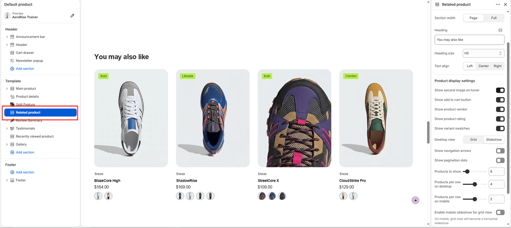
The Related Products section sits at the bottom of single product pages, leveraging Shopify’s recommendation algorithm to dynamically suggest complementary footwear and alternative shoe silhouettes based on the sneaker the customer is currently viewing.
It is a powerful cross-sell engine—suggesting alternate colorways, matching lifestyle kicks, or performance running alternatives to keep shoppers exploring your footwear catalog.
How to Access Related Products Settings #
- From your Shopify Admin, navigate to Online Store > Themes.
- Click Customize on the Sneax theme.
- In the top template selector, navigate to Products > Default product.
- In the left sidebar, scroll down and click the Related products section (or click Add section > Related products).
- Configure your layout, recommendation limits, and product card options.
- Click Save.
Layout & Appearance Settings #
| Setting Name | Type | Options / Range | Default | Description |
|---|---|---|---|---|
| Color scheme | Color Scheme Picker | Any configured color scheme | Scheme 1 | Controls the background and typography color palette for the recommendation grid. |
| Section width | Dropdown | Page width, Full width | Full width | Determines whether the recommendations stay within site margins or stretch edge-to-edge. |
| Heading | Text | Text | You may also like | Section title displayed above recommended footwear (e.g., “Similar Silhouettes”, “Complete the Look”). |
| Heading size | Dropdown | H1 – H6 | H4 | Sets the typography size hierarchy for the section heading. |
| Text align | Dropdown | Left, Center, Right | Left | Sets horizontal alignment for the section title. |
| Top padding | Slider / Range | 0px – 200px (Step: 5px) | 35px | Vertical whitespace above the section (automatically halved on mobile). |
| Bottom padding | Slider / Range | 0px – 100px (Step: 1px) | 35px | Vertical whitespace below the section. |
Footwear Card Merchandising Toggles #
Customize what interactive elements appear on individual recommended shoe tiles:
| Setting Name | Type | Default | Description |
|---|---|---|---|
| Show secondary image on hover | Checkbox | Disabled (false) | Hovering reveals a secondary shoe photo (ideal for showcasing the sole traction, heel branding, or on-foot angle). |
| Show ‘Add to cart’ | Checkbox | Enabled (true) | Embeds an instant size selector and “Add to Cart” button directly on the card to accelerate impulse purchases. |
| Show variant swatches | Checkbox | Enabled (true) | Displays clickable colorway swatches so shoppers can explore alternate shoe finishes without opening a new page. |
| Show vendor | Checkbox | Enabled (true) | Displays the shoe brand or designer name above the product title. |
| Show rating | Checkbox | Enabled (true) | Displays star ratings and customer review counts from your connected review app. |
Grid & Slideshow Controls #
| Setting Name | Type | Options / Range | Default | Description |
|---|---|---|---|---|
| Desktop view | Dropdown | Grid, Slideshow | Grid | Choose between a classic multi-column card grid or a smooth horizontal Swiper carousel on desktop. |
| Products limit | Slider / Range | 2 – 50 (Step: 1) | 8 | Maximum number of recommended shoes fetched by Shopify’s recommendation API. |
| Desktop products per row | Slider / Range | 2 – 6 (Step: 1) | 4 | Number of footwear cards displayed per row on desktop monitors. |
| Mobile products per row | Slider / Range | 1 – 3 (Step: 1) | 2 | Number of footwear cards visible per row on mobile devices (auto-collapses to 1 on screens under 400px). |
| Mobile slideshow for grid | Checkbox | Enabled / Disabled | Disabled (false) | Converts the static mobile grid into a touch-friendly horizontal swipe carousel. |
| Show navigation | Checkbox | Enabled / Disabled | Enabled (true) | Displays previous/next navigation arrows (when Slideshow view is selected). |
| Show pagination | Checkbox | Enabled / Disabled | Enabled (true) | Displays indicator dots beneath the slider. |
Pro Tips for Sneax Footwear Stores #
- Enable Mobile Slideshow: Turning on Mobile slideshow for grid keeps the bottom of your product pages compact, letting mobile shoppers swipe horizontally through 6–8 alternative sneakers with their thumb instead of scrolling endlessly down.
- Show Secondary Image on Hover: Footwear collectors love seeing the outsole tread and heel counters. Turning on Show secondary image on hover provides instant visual feedback that increases click-through rates.