

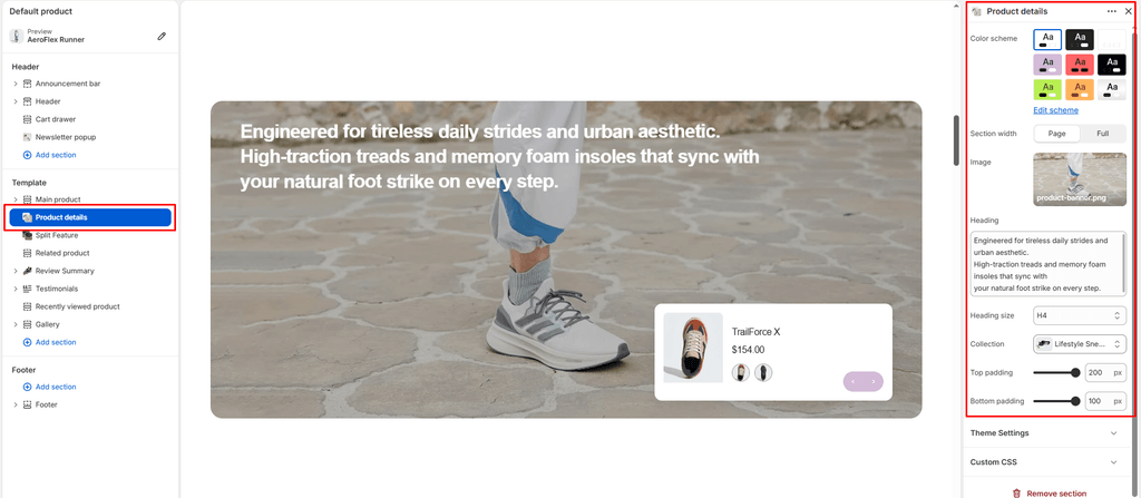
The Product Details section is a hybrid editorial and commerce spotlight in the Sneax theme. It pairs a high-resolution, full-bleed lifestyle hero banner with a floating, interactive product slider card overlaid directly on top of the image.
Accessing the Product Details Section Settings #
- Open your Shopify Admin and navigate to Online Store > Themes.
- Click Customize next to your active Sneax theme.
- Select the template where you want this section to appear (e.g., Home page, Product, Collection, or custom lookbook page).
- In the left-hand sidebar, click Add section and select Product details (or click an existing Product details section).
- The right sidebar will display the section’s layout, lifestyle media, heading typography, collection selector, and spacing controls.
1. General & Layout Settings #
Control the overall canvas width and theme color scheme.
| Setting | Type | Default | Options / Range | Description |
|---|---|---|---|---|
| Color scheme | Color Scheme | scheme-3 | Theme Color Schemes | Sets the background and color palette for the section container. |
| Section width | Select | Page width | Page width, Full width | Controls whether the hero banner is framed within the site’s content boundary (page-width) or spans edge-to-edge across the screen (full-width). |
2. Hero Background Image & Media Display #
The foundation of the section is an edge-to-edge lifestyle banner container featuring modern 20px rounded corners and an automatic dark ambient contrast veil ensuring text and cards remain legible.
| Setting | Type | Default | Options / Range | Description |
|---|---|---|---|---|
| Image | Image Picker | None | Image file (.png, .webp, .jpg) | High-definition lifestyle, editorial, or on-foot street photography. Supports Shopify native focal points and delivers responsive source sets up to 2000px. |
3. Section Heading & Kinetic Scroll Typography #
Positioned in the upper corner of the banner, the headline introduces your drop story, capsule concept, or accessory collection.
| Setting | Type | Default | Options / Range | Description |
|---|---|---|---|---|
| Heading | Textarea | Smart, versatile accessories built for daily use and style. | Multiline text | Section headline. Supports <br> tags for intentional multiline breaks. Integrates with Sneax’s word-by-word scroll animation (has-scroll-text-words) for an engaging reveal effect. |
| Heading size | Select | h2 | h1, h2, h3, h4, h5, h6 | Sets the typographic scale and hierarchy of the headline. |
4. Collection Integration & Floating Swiper Slider #
The bottom corner features a floating, elevated card housing a horizontal product carousel.
| Setting | Type | Default | Options / Range | Description |
|---|---|---|---|---|
| Collection | Collection | None | Shopify Collections | Select the collection to feature. The section automatically pulls up to 10 products into an infinite loop Swiper carousel. |
Floating Card Layout & Interaction #
- Compact Horizontal Orientation: Each slide presents the product in an ergonomic horizontal card—featuring an isolated product image on the left with the brand vendor, product title, and price on the right.
- Color Swatches: Variant color swatches are rendered directly inside the card so customers can preview available colorways on the spot.
- Integrated Navigation: Sleek circular navigation buttons are nested directly in the lower-right corner of the floating card for seamless next/previous slide transitions.
Spacing & Mobile Optimization #
Fine-tune vertical spacing and inspect responsive behavior.
| Setting | Type | Default | Options / Range | Description |
|---|---|---|---|---|
| Top padding | Range | 50px | 0px to 200px (step: 5px) | Top vertical spacing on desktop. Automatically reduced by 50% on mobile screens (< 768px). |
| Bottom padding | Range | 50px | 0px to 100px (step: 1px) | Bottom vertical spacing on desktop. Automatically reduced by 50% on mobile screens (< 768px). |
Mobile Behavior #
On tablet and mobile screens, the desktop diagonal layout automatically shifts into a centered vertical flow:
- The text content centers at the top of the banner.
- The floating product slider card reflows to center alignment at the bottom with a responsive maximum width of
400px, preserving full touch-swipe responsiveness.
Sneaker Store Best Practices #
- Spotlight Sneaker Care & Daily Essentials: This section is exceptionally effective for cross-selling high-margin shoe care essentials (crepe protect sprays, cleaning brushes, premium laces, sneaker storage crates) paired with an aesthetic lifestyle background of a sneaker restoration workbench.
- Feature Matching Apparel & Collab Drops: When promoting a flagship sneaker release, use this section to feature matching streetwear capsules (hoodies, track pants, caps, graphic tees) with an on-street model shot as the hero background.
- Choose Contrasting Background Imagery: Ensure the focal point of your lifestyle photography sits primarily on the opposite side of the floating card (or in the center) so the shoe card overlay does not obscure the key subject of the photo.